eDrop-Off Illustrations


The past few weeks I have been busy working on illustrations for a website relaunch called eDrop-Off. Now that the site is up and running I can share the illustrations with you! eDrop-Off is based out of Chicago and they are the leading designer consignment shop specializing in selling designer and luxury items on eBay. They offer the chicest designer labels, so my illustrations had to be on par with Chanel, Gucci, and Oscar.
They were such great clients to work with, very trusting and easy going. They loosely provided me with descriptions of what they were looking for (like "classic Chanel suit") and sometimes a pose (like "knees together,") and let me render how I saw fit, choosing colors, fabrics, hair, and accessories.
Every time we were about to be done a few more illustration requests were added, so it ended up being a pretty big job consisting of 8 girls, an authenticity seal, a stack of magazines with a designer shoe on top, a customized Tiffany bracelet and a bulletin board with "designer" push pins! I also did a few fun things for their launch party, but I'll share those another time.
The team at eDrop Off was an absolute delight to work with (thank you Nicole!) and I wish them continued success with the new website and in their new location.
Visit eDrop-Off to check out my illustrations in action, see all the fabulous designer items for sale, and maybe even send them some of your own. It's free pick nationwide, although I can't promise your UPS person will look like this one! (below)

New Cards & Bookmarks


Last weeks "Girls Night Out" sale was a success in that it had a great turn out and raised a substantial amount of money for a great cause, however I personally did not do so well. The positive side of this is that since I made sure to stock up for the sale by printing lots of new items I can now add as new listings in my Etsy shop; Brooklit.
Here are some of my favorite new cards. You may remember the girl in glasses and jeans from my denim "Tuesday Tip" tutorial. I liked her so much that I made her into a birthday card. The other fashion illustration's that adorn the new birthday cards are two of my more popular prints, Carrie and Mystie.
I've also made a fun new bridal card with a combination of some custom bridal illustrations and original ones. The bride card is blank on the inside which makes it suitable for any bridal occasion; engagements, showers, bachlorettes, weddings or even anniversaries.
My bookmarks continue to be popular, so I've expanded the selection. They're a nice, less expensive, alternative to purchasing one of my girls in art print form. And with summer now here, what better time for a fun new bookmark for all your summer reading.

Tuesday Tip: Sequins


A while back you may remember I wrote about my favorite tools for fashion illustration and I mentioned the whiteout pen. Well to successfully render sequins a whiteout pen is vital. (At least for this fashion illustrator!) It's also best when choosing your marker to pick a very wet and saturated marker, like a Chartpak and a classic black Sharpie marker.
I happen to really enjoy rendering sequins, especially all-over sequins (a-la Diana Ross or Cher.) There are a few specific steps to it, but don't stress, its pretty hard to mess up. And once you complete them the results are stunning.
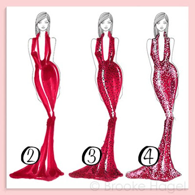
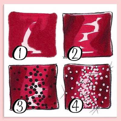
  1. You begin by coloring the base of your design. Its important to leave white streaks where you want your highlights. Let it dry a little then add a second coat of your color to areas in shadow (see example #1.)
  2. Outline the design, draw any seams, and add any extra shadowing with a dark pencil. I use the Prismacolor cool gray 90% pencil. (#2)
  3. With your black Sharpie stipple dots all over the garment (#3). Load up on dots in areas that are white and are going to be a highlight.
  4. With your whiteout pen place a dot on top of each black one. Get a rhythm going and it will be over before you know it. (#4)
  5. This is not a necessary step, but I like to add a few faint "X's" with my finest tip black pen to create subtle streaks of light. (I use a Micron pen, tip size 005)
The white dots will absorb the color you put down first, especially if you used a very wet marker. The dots will turn into a lighter shade of your color. This is why if you look at my examples, they don't look like white sequins on colored fabrics. It looks as though I've actually painted all these little colored sequins! And the tip of the Sharpie, being almost the same width as the whiteout pen, creates the perfect shadow to make each sequin pop.

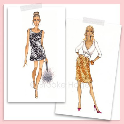
Above are illustrations from my Etsy shop of Carrie and Samantha (from the first SATC movie), both sporting fabulous sequin pieces. Carrie is available in a print, magnet or bookmark, and Samantha is on a bookmark.

Grandma Style


Three weeks ago one of my grandmas passed away at the age of 94. She lived near by, just over the bridge in Brooklyn Heights, in the very same apartment my dad grew up in, but sadly we weren't very close. Since she passed I've been combing through some of her old albums and photos, most of which I've never seen before. I wish she had shared these with me so I could have asked her questions about the faces, places, and times.
I picked a few fashionable favorites here, most of which are from the 1930's and 1940's. I just may have to add a new girl or two to my shop inspired by my grandma's style. (One photo, with the black dress and white pearl necklace, reminds me of my Allie sketch, only she has the wrong hair color.)

Nate Making Over NY


Eight years ago I, along with the rest of America, developed a serious crush on Nate Berkus. Within five minutes of stepping on Oprah's stage he began wowing us with his impressive makeovers and charm. The talented interior designer creates beautifully functional spaces that truly reflect the needs, lifestyles, and personalities of his clients.
There are many signatures to Nate's sophisticated, masculine, and modern design style, but one in particular especially resonates with me. Nate creates lovely walls of art displaying photo's, collections, mementoes and sometimes even personal "doodles" to be enjoyed by his clients on a daily basis.
These are some of the beautiful rooms from Nate's portfolio featuring his eclectic wall displays. I would love to take inspiration from one of these rooms for my small NYC studio apartment, add some fashion illustrations (of course!) and maybe swap the brass tables and frames with chrome and silver for a polished, fashionable and feminine space.
The room shots shown here are from Nate Berkus Interiors and the snapshots are mine, taken at Nate's first ever book signing, five years ago. My girlfriends and I all snuck out of work a few hours early and headed out to Long Island to be there and sit front row! I actually remember it like it was yesterday, Nate was a fantastic speaker, and we had a blast meeting him. The event was filmed by a camera crew so we were certain we'd have a little cameo on Oprah, but it never happened.

Recently Nate bid farewell to Oprah to star in his own show that will be filming here in New York! The only thing that would make the news any more exciting would be if I was working on it. (Hint, hint, Nate, if you need a design assistant with a talent for illustrating and shopping I'm available!) The show launches September 13th, so set your dvrs!

I wrote this post in honor of Nate Day on Twitter! Nate Day is the brainchild of the Moggit Girls. They've gotten just over 100 bloggers to participate by writing about Nate today and spreading the word about his new show. The shows producers are going to have one show filled with an entire audience of design bloggers so fingers crossed I'll be seeing Nate again soon! You can check out all the Nate Day blog posts here.

Girls Night Out: Shop Brooklit


I have another invitation to share with you, this time for a girls night out shopping event that I'm participating in. If your in the NYC area come by to say hi, shop, drink and support a great cause. I'll be there (along with other vendors) selling items from my Etsy shop such as prints, magnets, mirrors, and cards. I've also donated framed prints as raffle prizes that you could win!
Proceeds from the $10 admission ticket (which includes 2 raffle tickets) will be donated to the Rebecca School for Autism, a therapeutic day school for children 4 to 18, promoting the education and development of children with neurodevelopmental disorders of relating and communicating, including PDD and autism. To purchase your pre-sale ticket email: pta@rebeccaschool.org

(Invitation shown includes my Rose fashion illustration. Click here to see her in color or to purchase a print.)

Be Bold: Black & White Stripes


Mr. Graham, my high school art teacher, would always tell us to "BE BOLD." He would remind us as he strolled the room critiquing work, it was often scribbled somewhere on the blackboard and he even wrote it inside the card he gave me graduation day. Being that is was so reinforced, and that I'm a pack rat who saves everything, like his card, its one of those things that has really stuck with me. Well what's bolder than a crisp large scale black and white stripe!?!
(Clockwise from top left: Jessica Stam Vogue UK June 08', Vogue UK Feb 08', Vogue Italia June 94', Vogue Mexico Sept. 07')
When it comes to my fashion illustrations I try to look at each sketch and figure out what I could do to BE BOLD. While drawing Mystie here I started with this somewhat demure pose and my way to make it pop was to add my favorite pattern, large, and on a diagonal.
(Clockwise from top left: Valentino shoes, Christy Turlington Vogue US Apr 88', Neuropeach, Paul Costello for Domino.)
I've pulled a bunch of images here of other ways in which designers, stylists and decorators have used black and white stripes to achieve this striking and bold look. Do you like them? I know it's made me crave a little apartment and wardrobe makeover!

JCrew Bridal Boutique Invite


If your in the NYC area tomorrow, stop the opening of the very first JCrew Bridal Boutique. As if you needed more incentive, its being hosted by the fabulous Darcy Miller of Martha Stewart Wedding's. Isn't the invite adorable? I love that they chose to show only the back of the bride and her dog in matching veils and matching "dots." Too cute.