Custom Fashion Illustrations | FENDI


I recently live-sketched custom illustrations for Fendi at a private event down in Atlanta, Georgia. It was a fabulous fête hosted by southern socialites in which guests were given a custom sketch as a gift with purchase only after spending a whopping $1k, all to benefit the Epilepsy Foundation of Georgia.
I so enjoyed chatting with all these lovely ladies while helping to raise money for a cause they were so passionate about. Live-sketching in a beautifully designed new boutique as Fendi Buckhead was quite the treat as well. I even snapped photos of my business cards styled alongside the iconic baguettes (shown below) to share with my social media before the party started.
It was my first time in Atlanta and hopefully it won't be my last because although I was only there for a short visit I met such nice people, had some fantastic meals, and did some much needed holiday shopping. All in all, it was quite the successful little work trip. For more information on my event-sketching and availability for your next event, you can email me at FabulousDoodles@gmail.com.

Similar posts you may enjoy:

Framed Fashion Prints | IfOnly & American Express


I'm so excited to share that for the first time my fashion illustrations are available as framed prints! I've teamed up with IfOnly in conjunction with Platinum Card® from American Express to offer six different fashion prints. Each is beautifully framed in a classic black frame, matted in white, available in a variety of sizes and arrive ready to be displayed or given as a gift to your fashion loving friends and/or family.

Together we curated a small collection of my most popular illustrations and most "liked" images. I also sketched a new fashion illustration to be exclusive to IfOnly. "Georgia" (shown above) was originally created with black and white gouache paint on craft paper. She's a more stylized illustration than I usually render but I love her and am excited to display her my home complimenting my decor of mostly neutrals, black and white. Over the next few weeks I plan to share images of the prints styled throughout my home both here on Fabulous Doodles and via Instagram (@brooklit).
The fashion prints available in this collection are Georgia, Miriam (shown above, as shared on Instagram as I was approving the large-scale print quality a few weeks ago) Gwen, Blue Belle, Kay, and Bethany. Each print can stand alone as a strong piece individually yet they also compliment one another nicely if bought in sets or grouped together, as you will see when you look at the collection as a whole.

As always with IfOnly to make their offerings even more appealing, a percentage of proceeds will be benefitting a charity. My charity of choice is Hilarity for Charity. Started by my cousins, its an incredible movement led by Seth Rogen and Lauren Miller Rogen to inspire change and raise awareness of Alzheimer's among the millennial generation.

I'm so excited to have framed prints of my work available and just in time for the holidays. I hope you like them and should you make a purchase I would LOVE to see how you display them in your homes so please email, tweet, insta, and share with me and other #FabulousDoodles fans!

Similar posts you might have missed:

Party Sketching Golden Portraits for La Prairie


Today I'm sharing custom painted golden portraits of beauty editors I created for luxury skincare brand La Prairie at a private press preview party for their new products due out in February. The brand requested I work only in gold and custom illustrate only profiles. Painting solely in gold was a unique request, and it took a few trips to the art store to settle on the right mediums to achieve various effects and looks I was after to render highlights and shadows in all one cohesive color. It took a few tries to find what worked but in the end I found the right golden portrait formula. I really enjoying experimenting with new mediums and techniques, and dabbling with mixtures of gold acrylic paint, gouache, ink, pastel, brush paint pens and pencil to successfully render golden profile portraits that reflected La Prairies new "endless radiance" product.
La Prairies new product being launched contained gold so it was only natural the event was held at "golden hour" atop the Hugo Hotel with views of the Manhattan sunset. It was also the perfect event for my new luxe desk accessories! I recently received the most gorgeous Addison Weeks brass and moonstone cup (show above) as a gift which was perfect to hold and display my bevy of brushes. I scoured Etsy for new business card holders to compliment my brass and stone beauty and found a great shop of handmade stone objects created by a kitchen fabricator in California saving smaller unwanted pieces. He took my request for white marble and made me a long card holder of Carrara marble. It displays three cards at once so guests could see an assortment and choose their favorite. I couldn't be happier with how my new presentation pieces came together and complimented this event and venue.  
I custom sketch at parties and events quite often but this one was unique with the clients request of rendering in only gold and profiles, and to be honest I was a little nervous. But its important to try new things and push yourself out of your comfort zone sometimes. As usual this event went really well and both I, the client, and all the beauty editors I live sketched were happy with the radiant results.

Similar posts you may want to check out:

Boston Bound for Brooks Brothers


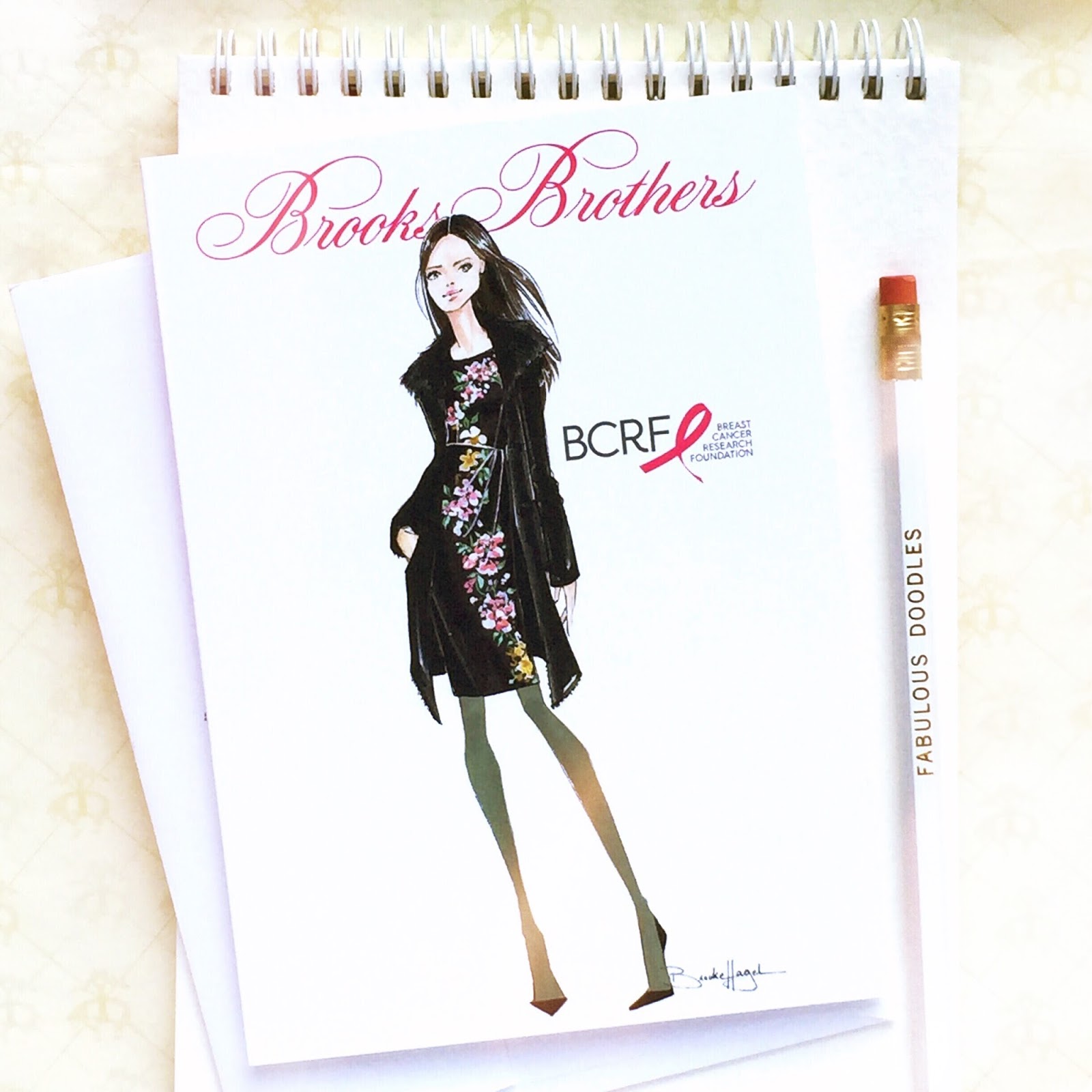
Today I'm Boston bound to live-sketch custom fashion illustrations at Brooks Brothers annual soirée benefitting the Breast Cancer Research Foundation. I'm looking forward to not only to meeting and sketching all the preppy and posh Brooks Brothers guests, but also to help raise money for such a great cause. It'll be my first visit to Boston, and I'm excited to sketching at Brooks Brothers famed Newbury Street store. A few weeks ago I illustrated a look from their recent womens collection for the invitation (also shared a sneak peek on Instagram) of a woman in a beautiful black shearling coat atop a silk dress adorned with a floral engineered print. They then took part of the floral print I rendered on the dress and used it as a decorative frame on the inside of the invitation, and I'm so pleased with how it came out!
If you're in Boston, I would love to extend the invitation to you. Below is all the information, including the RSVP.  25% of the evenings proceeds will be donated to BCRF, so you can shop while benefitting a great cause. Hope to see some of you there:

Thursday, October 22nd
6PM to 8PM 

Brooks Brothers 
46 Newbury Street
Boston, MA 02116

RSVP: MGREEN@BCRFCURE.ORG
646-497-2675

Similar posts you may enjoy: 


Last Stop, Charlotte | Vogue x Clinique


This Friday is my the last live-sketching event for this years Vogue x Clinique tour! I'll be down in Charlotte, North Carolina and I'm hoping to see and sketch some fashionable southern belles! In addition to this being my first time in Charlotte, its also my first time sketching at a Belk, which I'm excited about. Come by to just say hi, receive a fall trend review with a Vogue Stylist, a skin consultation, and get sketched by yours truly. Once again, we'll be turning the custom fashion illustrations into smartphone covers or you can pick from of my pre-printed designs, one of which is shown here on the invitation.

October 16, 2016
Belk SouthPark, Clinique
4400 Sharon Road. 
RSVP: 704.364.4251 Ext. 267

Make sure to RSVP and reserve your spot! And if you can't make it, be sure and follow me along on Instagram for  some snaps and sketches from the soiree!

Similar post you may want to check out:

Shiseido Beauty Illustrations


I teamed up with Shiseido to create custom illustrations for "Light My Story," Shiseido's social media campaign. The concept was over a few months to share the Shiseido story through illustrations, photos and art by various luminaries and in return have people share moments from their lives, and they're stories. Shiseido is 140 year old company, with quite a rich history and scope. The theme of the illustrations I was asked to create were: behind the scenes of New York Fashion Week (show above,) a woman accessorizing with her pearls and pearl infused face cream, a chemist mixing new products, and a woman being pampered with a Shiseido facial.
The intention behind the woman depicted within this set of illustrations was to have her ethnicity appear to be half Caucasian and half Japanese as Shisedio is a Japanese brand rich in Japanese traditions. She's to reflect a strong, healthy, traditional and beautiful woman, not overly trendy or made up. I even had to remove some accessories and makeup from the sketches throughout the sketch phase of the custom illustration process.
Over the past few weeks these illustrations have been shared by Shiseido and today was the final one, the chemist (shown below.) It was a unique project to work on and I really enjoyed learning about their brand and trying some of their incredible products. I now use one daily actually, the Power Infusing Concentrate Serum. Its one step in the many steps of the Shiseido facial process (shown above,) which layers products and steps similar to a Japanese tea ceremony.
Hope you enjoyed these beauty illustrations as much as I enjoyed illustrating them. For similar posts you may have missed check out:

Illustrated Phone Cases Benefitting Breast Cancer Awareness Month


October is Breast Cancer Awareness Month and I'm thrilled that three of my illustrated phone cases have been selected for Casetify's Pretty in Pink collection in which 30% of the cost of each phone cover will go to the Susan G. Komen Foundation. The first pretty in pink design chosen from my phone shop is Reiley (shown above.) She's pretty and polished in oversized sunnies, a pale pink top, and a bold dalmatian printed skirt. I love the way this illustration looks with its clear backing against the new rose gold iPhones!
Charlotte (shown above) looking up in her tortoiseshell sunnies and loose pink maxi dress is the other fashion illustration case chosen for Breast Cancer Awareness month. And my Kiss Kiss design of lip prints (shown below.) This pattern was originally designed for a Vogue promotion I worked on last year. Since the design was so popular when that project ended I added it to the shop since everyone could use a few kisses in their day!

All three designs can be purchased for any phone model, not only iPhones and are available in any phone case design (with bumpers, without, simple snap-on, etc.) With all three of these designs 30% of the purchase will benefit the Susan G. Komen Foundation throughout this Breast Cancer Awareness Month. Hope you like my "pretty in pink" designs and hope to see plenty of photos of you sharing your purchase on social! My instagram is @brooklit and I can't tell you how much I LOVE seeing my #FabulousDoodles phone cases tagged within your pretty pix! I even on occasion regram them!  
Similar post you may have missed: 

Stylus Sketching with Samsung & Macys


Today I'm sharing a few sketches I drew with Samsung's latest Galaxy tablet and stylus. I was asked to live-sketch at Macy's Fashion Front Row after party with Samsung for the last day of New York Fashion Week. I stylus-sketched for Samsung once before, also for NYFW, but it was a while ago and I hadn't done it since. Digital sketching, for me, is nerve racking as I'm a pencil-to-paper kind of girl. Luckily Samsung sent me a tablet prior to the party so I had a few days to familiarize myself with the stylus and drawing apps again. Shown here are some of the illustrations I created as practice, the first attempt being the one atop this post. It may look nice but I have to admit it took a long time and many, many touch ups. It's challenging to try and create illustrative effects you know how to do so effortlessly with actual art supplies, paint and markers when only using a single stylus and tablet but after some practice I got the hang of it...with a few hiccups. One feature I loved discovering was that one of the color libraries within it was by Copic Markers. So I was able to pick my favorite go-to marker colors for skin and hair. 
As I became more comfortable I decided to try and sketch from actual people and photos. The illustration above left is based off a photo of model Gigi Hadid and the coral crop top and full skirt look is inspired this look from Banana Republic's spring 16' collection. Just like last time, once I seemed to be getting the hang of using it it was time to give my Samsung Galaxy back. I may have to take the plunge and invest in one for myself, as it was a fun medium to draw in and I'd really like to experiment with it some more. 

The Macy's Front Row fashion show airs tonight on E! so check your local listing and check it out! I Sketched a few famous faces from the show and will share those soon! 

New Sketching Tour Dates | Vogue & Clinique


This week I'm heading to Westchester, NY and Orange County, CA to live sketch custom fashion illustrations and again, you're invited! My Vogue x Clinique 2015 tour is continuing on to two more place I've yet to live sketch and I'm so excited to meet and draw new people. Guests will receive a fall trend review with a Vogue Market Stylist as well as a custom fashion illustration by yours truly that will also be printed onto a custom smartphone cover, free with a $55 purchase.
First up is Westchester tomorrow (sorry for the short notice, I've been slammed this fashion week!) followed by California this Saturday. I hope to see you all there and make sure to RSVP and for an appointment! Its first come first served, but if I'm unable to get to you I've sketched this fun fashion pattern pre-printed onto cases (shown above) that will also be available at each event. Here are all the details for the next two events:

September 16, 2015
Lord & Taylor, Clinique
750 White Plains Road Scarsdale, NY 10583
RSVP: 917.723.7700 Ext. 230

September 19, 2015
Nordstrom, Clinique 
500 Brea Mall Way Brea, CA 92821
RSVP: 714.529.0123

If you can't make it, be sure and follow me along on Instagram and Facebook for a chance to win a custom illustration and cell phone covers! I'm planning to post a giveaway or two within the next week.

Similar posts to check out:

Designer Sketches for NYFW Spring 2016


Its New York Fashion Week again, which to me has always been a time to ogle over designer sketches which they release as a preview of their collection and the inspiration behind it. Aside from being pure visual eye candy for a fashion illustration lover, an aspiring illustrator can learn a lot by studying inspiring sketches and trying to achieve similar techniques.
I've picked only five this season and possibly my favorite of the lot is the Adam Lippes illustration shown above. I've always loved illustrations that look effortless and a bit unfinished. Knowing when to stop and not overwork a sketch is something I've always been a little insecure about in my own work. The contour lines of the legs, feet and face with a simple single stroke of skin color is what I like best. Another beauty is Mara Hoffman's illustration which perfectly conveys the bohemian look of her brand with long braids, a headband and a walking fashion figure that is ideal for a long flowing starry gown.
The next sketch by Joie (shown above) is charcoal on pale pink paper and looks as though it was made for Fabulous Doodles! The light lines and partially rendered floral print has such a lovely soft effect. Its airy and feminine and even as a simple sketch, the overall look is on brand with what I've come to and love Joie.
Next is a bolder sketch in monotone black and white by Tome. Its a little heavy handed and different from the others I've chosen, but similar in how it's partially rendered with a slight unfinished look. In this sketch its the body that is barely there, keeping all the focus and detail in palm print dress. And last but not least is stunning watercolor painted fashion illustration by Carmen Marc Valvo. The past few months I've been experimenting more with watercolor and gouache and I love seeing how other artists use it. The saturated black background which washes away toward the bottom is such a unique way to frame an illustration and something I'm eager to try for myself.

I hope you liked my top picks of designer sketches from the Spring 2016 collections and that they inspire you, as they do me, to try something new.
(Illustration by each designer via Elle and WWD.)

Similar posts you might enjoy:

Vogue x Clinique Invite | Houston


This Saturday my Vogue x Clinique sketching tour is hitting Houston, Texas! I'll be at Macy's Galleria live sketching custom fashion illustrations and turning them into custom phone cases as a free gift with purchase. Guests will also be given the option to choose a pre-printed phone case in lieu of a custom design, like the Clinique lipsticks shown here or a phone patterned with fun fashion figures. It will be my first live sketching event down in Texas and I'm excited about it! If you're interested in coming you can make an appointment via the number below. Hope to see and sketch you there:

August 29, 2015
2:00 pm - 4:00 pm
Macy's Galleria, Clinique Counter
5135 West Alabama Road, Houston TX
RSVP: 832-667-4224


Similar posts you might have missed:


Vogue x Clinique Sketching Tour 2015


I'm thrilled to announce I'm hitting the road with Vogue and Clinique again touring the country, live-sketching in various US cities starting this weekend in Seattle! Guests receive a custom illustration, which I'll draw on the spot as free gift with purchase, as well as a cell phone case customized with their illustration. I've also created two new patterns especially for these events which are going to be available as pre-printed smartphone covers, one of which is shown on the invitation above. It's a playful pattern of black and white fashion illustrations I hand painted in gouache, then scanned and photoshopped into a pattern.
Last year I was so pleasantly surprised to meet SO many of you, Fabulous Doodles readers and social media friends from across the country and I'm so excited Vogue and Clinique have brought me on board again. I'll also be visiting some new cities, I've yet to live-sketch in, and hope to meet even more of you fashion illustration enthusiasts. First up is Seattle: 

August 22, 2015 
12:00 pm - 2:00 pm
Nordstrom, Clinique Counter
100 Bellevue Square Bellevue, WA
RSVP at 425.455.5800

If interested in coming please do RSVP, as these events tend to fill up! First is Seattle, WA this Saturday followed by Houston, TX the following Saturday. There will be more cities throughout September and October and I plan to post all the invites and information here as they become available so be sure and check back often, RSVP and follow along on my social media channels. Hope to see and sketch you soon!
Similar posts you might like: 

Illustrated Book Covers: Chloe by Design Volume 2


I'm so excited my latest illustrated books, Chloe by Design Volume 2 are almost here! I've illustrated not only one, but four, new books in the Chloe by Design series and they're all currently available for pre-order! These books are available as single bound copy Chloe by Design: Balancing Act or broken down into four individual library bound hardcover editions: Intern Ambition, Design Disaster, Runway Rundown and Fashion Week Finale. As a sneak peek today I'm sharing a few of the cover designs, their base pencil sketches and a glimpse at them as they were illustrated works-in-progress done in pencil, marker, gouache and ink.
In this latest volume Chloe won the Design Diva tv competition and is now immersed in the world of a fictitious famous fashion designer as a design intern. She's assisting building his collection to show at New York Fashion Week. The theme of the collection is 1920s art-deco, so many of my illustrations throughout the books are bold geometric patterns and metallic motifs. I've always loved art-deco designs, so rendering many of these patterns and painting the intricate beaded embellishments they required was a joy.
My favorite illustration of the all covers turned out to be the menswear look (much to my surprise!) atop this post, adorning Runway Rundown. In close second was Balancing Act with its golden ballgown with beaded bodice and Intern Ambition's sequined deco cigarette pants. I tried to make each girl a different ethnicity and have a different personality to appeal to a wide audience but maintain a cohesive overall look. Chloe by Design volume two's release date is September 1st but you can pre-order your copies now. Be sure and follow me along on Instagram (@brooklit) too, as I plan to share peeks are the interior sketches throughout the next few weeks.

Custom Pet Sketches


The past few weeks I've been filling orders drawing one pet pup after the next and I want to share a few of my favorites here with you. Fashion illustration has always been my focus and I have to admit I was a little hesitant to commit to drawing something so different, but these darling dogs have charmed my socks off! 
(Drawn above: Gracie, Poppy, and Henry & Berkley by Brooke Hagel) 
In the past I would only occasionally draw a pet if a custom commission client requested it and until about a month ago I'd drawn maybe a half a dozen dogs, ever. But when I teamed up with IfOnly and we began brainstorming fathers day custom commission ideas, drawing man's best friend and offering dads ands dogs was a no brainer. Sometimes its refreshing to try something new and step out of your comfort zone. I'm so pleased I did and with the outcomes of all these delightful dogs. I hope they and their owners enjoy their custom illustrations as much as I enjoyed illustrating them!

Fabulous Doodles posts you may be interested in:

Sketches Inspired by Resort Collections


If you follow me on Instagram (@brooklit) you'll know that over the past few weeks I've been busy sketching some favorite designer looks inspired by resort 2016 collections. I've always loved the resort season collections, which are shown mid way through the fall and spring shows. Since so fewer pieces are shown designers have to keep their designs focused and concise. They also remind me of mini collection projects I'd design back in college. Each piece needs to serve a purpose, be well thought out and fit into the overall theme of the collection. Unlike fall and spring collections which can have as many as 120 pieces with both "filler" pieces and more avant garde looks that are solely for a dramatic runway moment, resort can have as few as 15-20 pieces.
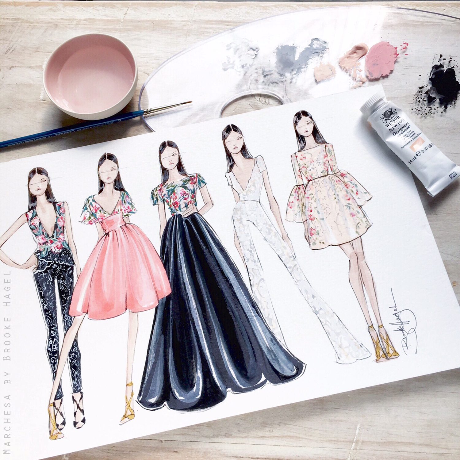
The first collection I've illustrated here is Marchesa, consistently flawless, feminine and always a favorite of mine. This Moroccan inspired Resort collection featured a bounty of embroidered flowers inspired by Moroccan tiling, with intricate laces and a beautiful color palette of blush pinks, coral, black, white, gold and navy. In rendering this collection I chose the silhouettes I liked most that were also comprised of the laces and full floral embroideries that made the collection so exquisite and I enjoy rendering. The two to the right were two of my favorites both within the collection and in the outcome of the illustration. Theres something about sheer fabrics, like the v-neck white lace jumpsuit and peach organza bell-sleeve dress that make them so chic.
Rachel Zoe is next. Black and white is an eternal favorite of mine, along with much of the New York fashion set and her Resort 16' collection combined them beautifully with shimmer, embellishments and luxe fabrics. My favorite pieces to illustrate (shown above) were the ones that used beaded fringe, black and white stripes and chevron, and combinations of leather and suede. I illustrated these girls very elongated and stylized. This is the fashion illustration style I favor most however rarely use anymore since clients tend to prefer a "healthier" girl. To me though this is the epitome of fashion illustration. After completing these sketches I really want to keep along this vein and try to do more in this style, at least when drawing for myself, where I'm the sole opinion that needs to be taken into account.
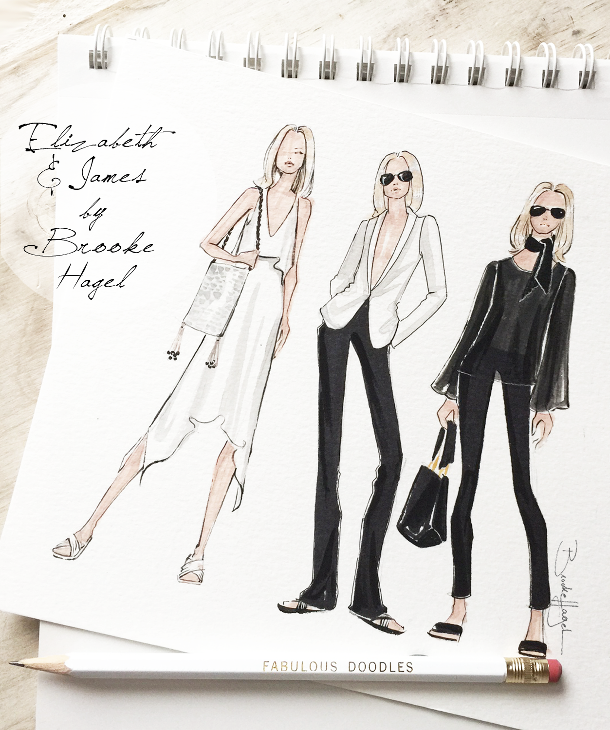
Last up is Elizabeth and James by Mary-Kate and Ashley Olsen. This collection, in my eyes, was the for the quintessential "cool girl." Another classic palette of black and white featuring loose and slouchy dresses, wide-leg trousers and tailored blazers. They played with proportions and volume and put together a strong resort collection. Surprisingly the pant looks were my favorite to illustrate of the all the pieces, as show above middle and below.
For design students looking for mini collection inspiration or to the fashionphile looking to explore new designers I suggest browsing through the resort collections, always a hit in my book.

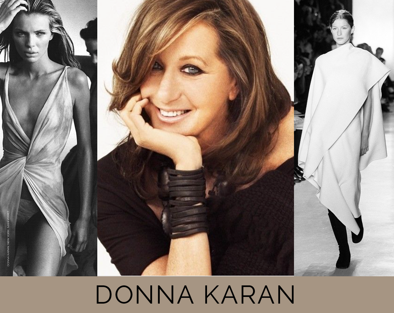
Donna Karan | End of an Era


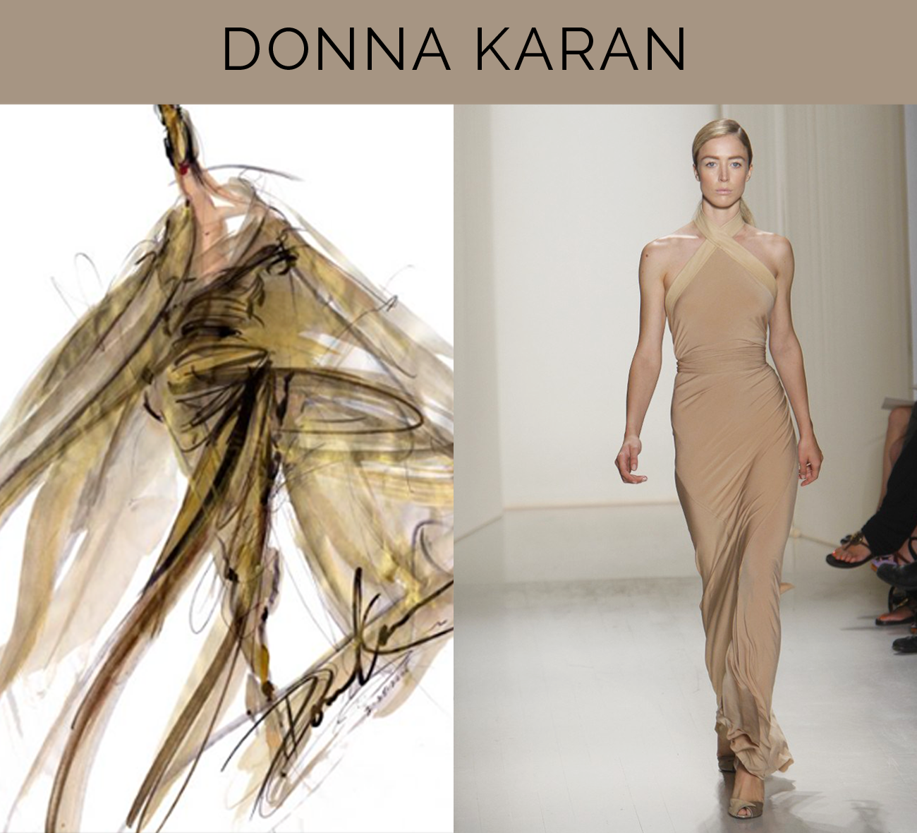
(Above: Donna Karan fashion sketch, Donna Karan RTW Spring 08')
Last week Donna Karan announced she was stepping down as chief designer of her namesake company Donna Karan International and I can't help but feel its truly the end of era. As a huge admirer of her work since my pre-teen years it shouldn't come as a surprise to me how much the news has effected me. In my early days of studying fashion design at FIT I'd often be assigned market research reports and store visits and my first stop was always the Donna Karan Collection store. I'd study the slinky gowns, chat about the collection with the staff and always ask for a lookbook to take home to study and often add to my mood board wall. (This was before photos from the collections were available at your fingertips online.)
(Above: Esther Canadas shot by Peter Lindbergh for spring 00' campaign, Donna Karan shot by Ruven Afanador, Donna Karan RTW fall 99')
Karan has always had a remarkable understanding of a woman's body. Along with sophisticated color palettes in luxurious stretch fabrics, and unique knits, made her consistently my one of favorite designers. Her luxe New Yorker esthetic alway came through in her ads which were regularly shot by the fashion industries top photographers and featuring the most sought after models of the moment from Iman to Esther Cañadas to Kate Moss and most recently Karlie Kloss.
(Donna Karan campaign shot by Patrick Demarchelier featuring Karlie Kloss and Donna Karan Atelier sketches for Anna Kendrick) 
I met Karan once, it was 1999. I had just began studying fashion design full-time and the meat packing district was beginning to become a shopping mecca, you still had to walk by hanging carcasses lining the sidewalks to get to stores. Those days are since long gone, now its one pristine luxury shop after the next. I was walking around with my dad and asked if he'd mind if we stopped by the new "it" store, Jeffrey. I walked in carrying my favorite black leather bag by Karan (also my very first big ticket bag splurge) and who do I spot but Donna Karan herself shoe shopping with her daughter! Needless to say I was completely starstruck! My dad being my dad made me say hello and introduce myself but its honestly all a daze. I just remember being excited to have been holding my Donna Karan bag at the time. I rarely get that starstuck. So far its only been her and Sarah Jessica Parker that I've managed to embarrass myself meeting. (To SJP my first words were "it's you!?!" So embarrassing! Cut to a few months later though and I found myself working as a wardrobe intern on the set of Sex and the City.) I digress and seem to be going off on a tangent but I felt it was important to take a moment here on Fabulous Doodles and write about how important Donna Karan has been to me over the years and how sad I am to see her stepping down. I don't mean to eulogize her here, I realize she's not gone-gone but Donna Karan and her brand truly made a mark on me, my design sense, and the fashion industry.

Previous posts including Donna Karan:


She's a Sketch: Photographer Illustration


Recently I found inspiration at a party I attended with my friend Lindsay for La Maison du Chocolat. Lindsay was running a little late and I decided to people watch outside as I waited for her. I stood to the side as the event photographer snapped photos of guests arriving and posing on the step-and-repeat, all the while admiring her look. From her Tibi-esque ensemble to her on-trend laced up summer sandals and sophisticated but simple pulled back hair, pretty makeup, and sweet smile, she was a walking sketch! At least to this fashion illustrator.
Once Lindsey arrived and it was our turn to be photographed I introduced myself to the photographer, Kelly Taub, and asked if she would mind pausing a minute to pose for me. I explained I was a fashion illustrator, loved her look and was eager to put it to paper. The very next day as I worked on the illustration I was so excited about it I decided to share the work-in-progress via Instagram. I posted a close up of the initial pencil line drawing and a sneak peek while applying finishing touches. Now I'm happy to share the full illustration, and Kelly can officially say: "she's a sketch!"

"She's a sketch" is something I used to write about here years ago when I first started Fabulous Doodles. It's a phrase/title that my friend and designer Renaldo Barnette and I always say to one another when we spot a girl with either an impeccable fashion sense and sketch-worthy ensemble and/or exquisite fashion illustration proportions or facial features. I haven't done one in ages but I hope you enjoy it! When inspiration strikes you have to go with it, and I'm so happy I did.

Similar posts that might interest you:

Gift Custom Family Illustrations | Brooke Hagel & IfOnly


I'm so excited to announce that for the next few weeks I've teamed up with IfOnly to offer custom family illustrations just in time for Fathers Day. IfOnly is an emporium where connoisseurs shop for one of a kind, extraordinary experiences and gifts for good with hundred of top luminaries. A portion of every gift benefits a charitable cause! I've chosen Hilarity for Charity, a charity near and dear to my family that was founded by my cousins Seth & Lauren Rogen. They're leading a movement to inspire change and raise awareness of Alzheimers disease among the millennial generation.
These custom sketches are available within just days for a limited time, leading up to Father's Day via IfOnly. You simply place your order on IfOnly then send their incredible concierge team your photos and any art direction you want me to have and within a few days your custom illustration is drawn and in the mail. I'm sketching every family member, from dad alone with his fishing pole to whole families, to vintage inspired wedding illustrations from your parents or grandparents wedding (check out my stylish parents circa 1973 atop this post!), and even the family dog!
I've already been filling orders and sketching away for about a week now and I'm really loving the outcome so leading up to Father's Day I've decided to share sneak peeks at some of the commissions over my Instagram feed. Sketches in progress include a dad preforming alongside Snoop Dog, a young NYC family of three, more precious pups and a even a grandpa!

I'm really excited about this collaboration with IfOnly and hope in addition to giving dads custom keepsakes I can also help to raise a little money for a great cause. You can check out all my IfOnly custom illustration offerings here and visit Hilarity for Charity to learn more about my funny family making a difference in the fight against Alzheimers.

Similar posts you may have missed:

Book Signing | Chloe by Design Balancing Act


For the second consecutive year I'm heading to Book Expo America for a book signing of my latest illustrated book in the Chloe by Design series, Balancing Act. Free advance copies of the book will be given out and I along with author Margaret Gurevich, will be meeting, greeting and signing. Last years signing was a huge success and even landed me a little feature in Publishers Weekly! Hopefully this years will be just as fabulous if not better. Here are all the details, if you're in New York I hope to see you there:  

 Jacob Javits Center 
655 W 34th Street NY, NY 10001
Book Expo America, Capstone booth #2929
Saturday, May 30th, 2015 
2:00pm-3:00pm

Chloe by Design Balancing Act is available for pre-order now on Amazon. Leading up to its release later this summer I'll be sharing sneak peeks of pages my "Chloe" fashion illustrations, so stay tuned! 

Similar posts that may interest you: 

Hamptons Magazine Sketches


Hamptons Magazine kicked off their very first Shop Hamptons page yesterday and I'm thrilled to say its adorned with Brooke Hagel sketches! Editor In Chief Samantha Yanks commissioned me to sketch out illustrations for the new page that each week will feature her top picks for Hamptons summer essentials of locally made products and artisan boutiques.
For the header I illustrated a quintessential Hamptons beach, dunes and all, with a girl laying out surrounded by her must-haves. I also drew a bunch of smaller illustrations to act as icons for categorizing the fab finds; shopping, home, beauty, food and wine. I'm excited to follow the page throughout the summer for all Samantha's spy luxe Hamptons treasures!
Similar posts to check out: