New Years Already?!?!


I'd like to send a big bloggin thank you to all of you; my new readers, clients, and friends! Starting this blog was very intimidating, since I've never felt that I was that strong of a writer, but it's been a fantastic process. Thank you for all your support, comments, questions and encouragement. It's been a bit of a tough year but I hope that 2010 is filled with lots of creativity, love and success!

Pictured above are Thank You cards that a made a few months ago when I was obsessing over my lined ladies (remember this post). I didn't get around to adding them to the shop until today... Perhaps one of my New Years resolutions should be to stop procrastinating so much! (Here is the set above and here is a variety pack)

Thanks again everyone and I hope you all have a FABULOUS new year!

My Mini Makeover


I don't know if this is an issue for all creative and artist types, but I have a major problem committing to a look, but only when tackling myself and my own brand. When I'd work on projects for clients or particular brands its never a problem to pin point the brand identity, develop the brand esthetic and create mood boards, products, or art direction. Somehow though when its for myself I'm the queen of indecisiveness.
I'm not sure if this is definitely the look I'm going to stick with, and I hate the idea of changing it again, but enough is enough and I need to at least try this out. So as I'm sure you've noticed my blog has gotten a little face-lift with a new header. Now the blog visually matches my facebook fan page logo, twitter page, etsy shop banner (above), and business cards (shown below.)
I'm toying with changing my blog name, and making my brand more cohesive. (I love Fabulous Doodles, and feel it captures what my blog and my illustrations are all about. Fabulous being a staple in fashion lingo and doodles meaning cute sketches. Although my illustrations are more than casual doodles.) My email is also FabulousDoodles@gmail.com but maybe everything should be called Brooklit like my etsy shop or maybe I should just use my full name, as I do on my facebook fan page.

Oy, I just don't know. Sorry for the rant, I just thought I'd share my little dilemma here with you. Please comment or email me any feedback you may have, I'd appreciate the input. :)

Happy Holidays


Just wanted to wish everyone happy holidays!
(With my "shopping girls" I drew for this years now sold out gift tags!)

New to my shop: New Bookmarks


As I've mentioned here before I'm a pretty big reader and one thing that I feel really compliments a great book, besides a bubble bath of corse, is a great bookmark. I've been trying to add more budget friendly items to my shop. Times are tough and not everyone can splurge on print, so I've been trying to come up with ways to get "my girls" out there without the double digit price tag. First I added mini prints to the shop, and people seem to like those, so now I've added some more bookmarks.
The new bookmarks are available in sets of three; They're Back, and my favorite Blondes, as well as individually.

Fall in Love With...


Audrey Schilt. Two weeks ago while running to the subway amidst NY's first snow fall of the season I saw something that stopped me in my tracks. I was passing by my alma mater, the Fashion Institute of Technology and four huge fashion illustrations were on display in the windows. Normally its student work on display in this particular building but once I got closer I was floored, they were fantastic illustrations and inside was an entire exhibition of hundreds of them.
I hesitated going in, it was already dark, snowing out, and I was wanting to get home to my warm dry apartment, but once I walked in...wow, I was going to be there a while. Especially once the guard told me photo's were allowed! (Photo's are never allowed in the FIT museum across the street, but this was just the lobby of the D building.)
The whole exhibit featured illustrations by one illustrator, Audrey Schilt, a fellow FIT alum. For over thirty years Audrey sketched and designed for some of the most revered names in fashion. Audrey got her start working aside fashion icon Halston. "But Schilt is perhaps best known for her work at Ralph Lauren. Audrey worked with Ralph Lauren side by side for twenty-two years as he built his fashion empire. Schilt helped Lauren interpret and illustrate his creative ideas and eventually became his Creative Director of Collection, VP."

Each wall of the exhibit featured a different collection from her time at Ralph with a little write-up from Audrey on the mood, inspiration, and design evolution of the collections. The illustrations shown here are from the "Aviator" collection. I remember this collection well because the ad campaign for it was close ups of the mood boards, with fabric swatches, old photo's, findings, and designer sketches. (I'm a master at creating mood boards if I do say so myself. In my last nine-to-five I spent hours upon hours creating polished mood boards for designers, editors, and high level execs.)
About a year and half ago I had a meeting at Ralph Lauren Home. One of the highlights of the afternoon was after the meeting I got a personal tour around the offices including the mood board room. The boards measured about four feet wide by 6 feet tall and included every fabric sample from the runway collection. Not just swatches mind you, but full length fabric samples, think curtain samples! They were amazing. I could have stayed in that little room looking over those boards all day. Better yet, I think Ralph Lauren just needs hire me as a mood board rigger! Sorry for the long tangent here. But when it comes to Ralph I have a lot to say, I'm a huge fan of the man, the company, and the flawless lifestyle branding.
But back to Audrey now! I love collecting and studying designer illustrations. Seeing the different techniques, and the poses chosen to best illustrate design details of the garments. Audrey's illustrations have so much personality and spirit, I just love them and I'm sure you do too.

Secret Weapons


Every so often I receive an email asking what art supplies I use and which brands I prefer. I answer all emails and try to be as specific as possible, but I thought maybe it was time I blogged about it. Maybe your interested and just haven't asked me, and if not, at least in the future I can just refer inquiring minds to this post. So without further ado here are the top products I absolutely could not live without. (As far as illustrating for my etsy shop goes! If we're talking desert island or beauty essentials that's a different post for a different blog! ;)
First and foremost are the Prismacolor pencils in cool gray 90%. I use this pencil on EVERY single illustration. Black can be too harsh, especially when outlining the figures and drawing facial details. These pencils (I pluralize that because I usually have anywhere from two to ten of them on my desk at one time) are an essential must have, at least for this fashion illustrator. It's my finishing touch tool, that I outline with, add the facial details, and all the clothing seams and trims.
Brush-tip markers are next. Sometimes people are surprised that my illustrations are all created with markers and pencil. I'm pretty sure the reason for this because of the amazing watercolor and painterly effect of the brush tip markers. With a brush tip marker you can create a multitude of effects to render fabrics, hair, and skin.
There are two brands that I use. One is the Copic Sketch double ended marker (shown above.) One side is a broad and blunt 1/4" slanted marker tip, and the other side is saturated brush tip. These markers are definitely on the pricey side at $6.99 each, but once I started using them (just a few years ago) I was hooked. I have every value of warm and cool grays for all my bridal illustrations as well as about 8 skin tone options. And of corse all the colors I use for clothing, shoes and accessories.
The second brand of brush-tip marker I use are the Staedtler Mars Graphic 3000's. They are also double ended, but with these one end is a fine tip and the other is the brush. I've been using these to render hair ever since my college days and feel that they're really the secret to my success behind some of my most popular fashion illustrations like Vogue, Hostess, and Lily.
The last "secret weapon" I'd like to share with you is probably the biggest surprise as I do not use it for what it's designed to be used for. Drum roll please...Its a white out pen! No, I do not use the white out pen to fix any corrections in my artwork. The white out pen is used for all my sequins, beading, pearls, and sometimes as that little sparkle in the eyes. The way to pull off the beading or sequin effect correctly is to first create a shadow for the beads or pearls with a black dot made with a Sharpie marker. (I love the new retractable Sharpies that are offered now.) Then you dot over the black with the white out pen and viola, you have your glitz and glam! You can check out Allie's necklace, Carrie's dress (a sequin leopard print fabric) or Kabuki's beaded gown to see the final result.
I hope you enjoyed this little trip into my tool box! Now maybe you'll look at fashion illustration a little differently!?!?

(The adorable pink scissor print paper is a purchase from the Martha Stewart Craft Sale!)

Warhol The Bazaar Years {Part 2}


Here are a few more highlights from the Andy Warhol exhibit currently on display in the Hearst Tower (shown below). For this post I grouped scans of the catalogue together in a collage like way to highlight his whimsical illustrations of accessories and products.

"Warhol found almost immediate success after arriving in New York...Armed with a portfolio of his student drawings and a degree in pictorial design from the Carnegie Institute of Technology (now Carnegie Mellon University)." (Charlie Scheips, exhibit catalogue) Shortly after arriving in New York, Warhol began illustrating for Haper's Bazaar. He collaborated with Bazaar editors for thirteen years.

Warhol The Bazaar Years {Part 1}


Last week I visited my old stomping ground, Hearst Magazines, for a meeting. On my way out I decided to check out what was on display in the gallery. I'm glad I did because it turned out to be a fantastic exhibit of artist design spreads for Harper's Bazaar by Andy Warhol. "This exhibition of Andy Warhol's work starting in the 1950's for Bazaar is relatively unknown and unique. " (Anthony T. Mazzola, exhibit catalogue)
The exhibit consisted of large scale reproductions of the original pages and spreads from vintage issues of the magazine. (A great job by Simon Alexander who directed the duplication of the images as they originally appeared. I always enjoyed working with Simon when I was at Hearst!)
While working for Bazaar Warhol created hundreds of illustrations but most of the works no longer exist, as it was not usual to return artwork to the artist and Bazaar does not have an artwork archive. The illustrations only survive within the spreads of the vintage issues.
While at Bazaar Warhol became well known for his shoe drawings. But in addition to the shoes he drew lot of accessories, beauty products, perfumes, butterflies, garments and cats.
Unfortunately the Hearst Tower is not open to the public, otherwise I'd tell you to go check out this show. I'll post some more images from the show tomorrow.

Holiday Shops


If your in the NYC area I highly recommend checking out these two fantastic shops I'll be heading to this weekend. The first one is a booth that my uber talented friend Aaron has set up within The Holiday Shops at Bryant Park. Aaron is an incredible illustrator and fashion designer (with a jaw dropping resume.) He will be in Bryant Park selling greeting cards featuring his fabulous ladies everyday till Dec. 24th. It's booth #F01 on the corner of 42nd St and 6th Ave.
The other must hit sale is the Martha Stewart Holiday Craft Sale. It's the first time this sale is open to the public and will only be open tomorrow, December 5th. (Click here for more info) I personally am a huge fan of all that is Martha. (Little secret: Martha and I share the same birthday, and when I was 13 I met her and told her so. She definitely did not share in my excitement, but I love her and her amazing company none the less!) I'm really looking forward to seeing the unique crafts and handmade goodies that her staffers have come up with.

New to my shop: Holiday Cards & Tags


I'm a little late on this one, being that we're into December already, but I've finally sketched some new holiday illustrations, put them on cards and tags, and added them to my shop. The ladies are each toting wrapped presents and gift bags in varying patterns. (I love illustrating wild prints and patterns! I'm always amazed how authentic patterns like zebra, leopard, and plaid come out when you take the time to render them properly. I usually steer clear loud prints and patterns when it comes to clothing, so it's great to add them on gifts, bags, and accessories.) When choosing colors I made them holiday neutral so they could be used for Chanukah, Christmas, birthdays, or any gift giving occasion.

Handmade Holidays


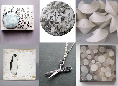
The holiday shopping season is upon us and with that comes mailboxes full of catalogues, mass emails with discount codes, and big box store promotions. I wanted to write this little post to urge you to buy handmade. Not only will you be supporting artists and your community, but you will also be getting and giving something special, made with heart.

I've scoured Etsy and put together my own little gift guide of handmade treasures. Some of the sellers are personal favorites of mine that I've purchased from before and others are simply on my wish list...To my friends and family, I'd be trilled to receive any of these handcrafted pieces! ;)