Holiday Girls


Last summer I was hired to create illustrations for holiday cards (here's my Christmas in July post) and now that spring is just around the corner what better time to make some more, right? (hehe) The same company hired me again to draw a few more holiday themed illustrations to complete the set.
This time I not only created the illustrations but came up with the concepts as well. The idea behind the first one (top of post) was a girl posing with her fashionable snowman, and the second one (above) is a girl tangled in vintage lights. With a big skirt and star on her headband her silhouette is meant to mimic a tree.
The third (above) is a girl excitedly showing off her craft skills while preparing for her guests to arrive. My festive ladies are being presented to a few major department stores but nothing is set yet. I'll be sure and let you know where and when they land.

Laura Linney


Sunday night I attended another fabulous event at the 92nd Street Y; a Conversation with Laura Linney. (Whom ever since seeing in Love Actually, I love!) Laura has three Oscar noms, a successful career on stage, film and television, and is the kind of girl you just want to spend a day with gabbing over brunch or strolling through the Met.

I've been a to few events at the famous Y but have never before submitted a question for the guest of honor. The theater fits 902 people and only a handful of questions are chosen, so skeptical me never thought my question would make it to the stage. For Laura though, I decided to give it a shot. My two part question was not only chosen, but was the first one asked of only four audience questions picked!
My question was "of the character's you've played, which one was your favorite due to their wardrobe?" After a brief pause of thought Laura answered Abigail Adams, in the John Adams miniseries. (My friends and I were so excited to hear my name and my question that I almost missed her answer! I'm also embraced to admit that I missed the series, but now need to schedule a marathon asap.) I followed with "which outfit from your personal life has been a favorite?" I was thinking she would name a fabulous couture gown she's graced the red carpet in, but I was wrong. Laura said that she doesn't think that one's come along yet. Interesting right.

Inspired by Rosa Clara


This week I've been working on bridal illustrations for a new multi bride print I'm going to try out in my shop. Sometimes I'm inspired by my friends, or a design detail I saw while shopping, and sometimes I just come up with a design out of my head and "wing it." Yesterday however, I discovered the website of Rosa Clara (here). I don't know how its possible that I've never heard of her before. I mean I've done my time as a bridesmaid, taken the trips to Kleinfelds, read through the magazines and have seen a million episodes of Platinum Weddings!
The art direction and styling of the photo's on this site are gorgeous. It's as if your thumbing through a high end bridal magazine with fabulous editorial. The designs are also pure sophistication so needless to say, I was inspired and decided to sketch some brides based on them. I'm so excited about these little ladies, I just love them and love that I've found a fantastic new site for bridal gown references and fabulous poses.

Photos: Rosa Clara

And the winner is...


Thank you to everyone who entered my first blog giveaway! With the help of the Random number generator, I have three winners; Jennifer, Kala, and Stephanie. All of whom ironically enough picked the same bracelet, "Love," benefiting children in need.
Congratulations ladies, and thank you again to all those who entered and to my friends at Team Project360 for donating the fabulous prizes.

Wallpaper Discoveries


Sunday afternoon I met up with a friend and former colleague and we trekked on over to Pier 94 for Architectural Digest Home Design Show. There were a lot of noteworthy exhibitors showing their collections, the most unique of which were the fabulous wallpapers. The colors, patterns, and textures offered were just so fresh and beautiful.
The first one here is a UK based company called Fromental. This paper was absolutely stunning in person, I kept walking away and having to turn back for one more photo. The company's website says they offer "couture for your walls" with their exquisite hand-painted and embroidered papers I couldn't agree more, couture it is.
The watercolor selections from Eskayel were like nothing I had ever seen before. Artist Shanan Campanaro creates each design by extracting segments from her original paintings. As shown here she not only applies these designs to wallpaper, but pillows and ceramics as well. They have a very ethereal feel due to the lovely color palette and watercolor medium she uses. (Shanan let me chose a sample which I plan to frame and add to my art wall! I'll be sure to post a pic for you once I frame it.)
Design Red is a Chicago company that specializes in fine decorative painting. I highly recommend taking a few minutes to browse through their online portfolio (here). It's amazing what this team can do with a few brushes and paints.

Since I live in a little NYC rental apartment and cannot take advantage of these now, they will definitely be added to my style files for the future!

The Brides are Coming


The weather here in NYC this past week has been absolutely gorgeous. With spring coming and many emails popping up asking about my custom bridal drawings (here) I know wedding season is just around the corner. So I've decided while I have a little free time to illustrate a fresh batch of brides and design a print for the shop with all of them. These three ladies are a little sneak preview.

I hope you have a fabulous weekend and don't forget to enter my giveaway by leaving a comment in the post below for your chance to win one of 3 Project360 bracelets.

Retail Therapy: Project 360 Heart Hoodie


This happens to be one of the softest and coziest garments I've ever owed and its cute to boot. Although I've been a long time fan of Team Project360 (a close friend of mine is the CEO and I always support my girls!) it wasn't until two weeks ago while out in LA, that I actually bought my first piece from the collection and have barely taken it off since! (In my Oscars post, you can spot me wearing it will prepping my illustrations.)
My limited edition hoodie (originally made for Valentines day) is made of organic cotton and recycled leather. Each item in the earth-friendly collection is made with the goal of generating awareness of global issues. The philosophy behind the company is that "even the smallest act can make the biggest difference to a person in need." So you can have this chic and cozy staple that you won't want to take off while helping to better the planet. Since purchasing my heart hoodie and falling in love with it I've had to place a second order. (My "LOVE" hoodie is on its way.) If you would like one too they are available at upscale retailers Henri Bendel, Fred Segal, and Charlotte Ronsen or online here.
And now, drum roll please. . .I'm pleased to announce that you can enter here to win a Project360 leather bracelet! I mentioned to my friend that I was posting about my fabulous hoodie and she offered up 3 bracelets for my first ever giveaway! You can chose from six different words that benefit six different charities. Simply comment below with your name, email address, and the bracelet you would want; Love, Empower, Truth, Hope, Peace or Dream. You can also follow Team Project 360 on Twitter (here) or become a facebook fan (here) then let me know you did so by commenting again. Meaning you can enter up to three times! Three winners will be chosen. You can enter until midnight March 23rd. Good luck everyone! I wish I could win, these babies are worth $68 each!

Tuesday Tip: Lips


This week I want to get specific with you and focus on one feature, the mouth. There are many different ways to draw a mouth; smiling, smirking or even frowning. I'm going to show you my standard go-to perfect pout. Once you master this it's easy to play around and try variations.

1-Start by drawing a circle. Then draw one line through then center horizontally and another vertically.
2-Mark the sides and center with slightly darker "dashes" and begin drawing the contour of the mouth.
3-Lightly erase all the lines. (Once you add marker you cannot erase, the marker sets it into the paper.) Just leave the faint pencil lines so you can still see where to apply color.
4-Add a second coat of marker to the entire top lip and very bottom edge of the bottom lip. Then with your dark pencil lightly outline and add shadows in the center middle, center bottom, and sides.
Something important to keep in mind when drawing the mouth is the top lip is ALWAYS darker because its in shadow. Look in the mirror or some photos and blur your eyes and you'll instantly see it. Above is an example of the "perfect pout" on Audrey from my etsy shop. (Dylan, Vogue and Mystie all sport a variation of this mouth as well.)

For now this is the last tuesday tip. It was only set up as a four week series, but I do promise to resume it again sometime in the future. Thank you though for all the positive feedback! Happy sketching!

Blog it Forward: Inspired by...


Today's post is all about what inspires me. This post is part of Blog it Forward. I'd first like to send a big thank you to Victoria of SFgirlbybay for arranging this, it's been so fantastic to read through what inspires people and discover new blogs in the process. Yesterday was Every Little Wonder's turn and tomorrow will be Fashion Foir Gras, so be sure to check them out as well. Now without further ado, here is what inspires me and many of my fashion illustrations:
First up, New York. I love my city, there's simply no other place like it. In the city that never sleeps there is inspiration around every corner. From the people walking the streets to the museums and exhibits that you stumble upon, to the city itself, New York is one of a kind. New Yorkers too for that matter! (Every trip I've taken abroad people have called me and/or my friends out as being New Yorkers!)
My Fabulous Friends. I have an amazing group of friends that are my little secret tribe of muses. I'm constantly inspired by them, from outfits they show up to dinner in to photo's they post on facebook to their latest hair styles! Elements of my friends show up in almost every illustration I create.
Traveling. I absolutely love to travel and explore new places. The two activities that I think are vital when traveling are people watching and shopping. One of the biggest perks of traveling is the being exposed to new things and new people. It's so interesting to observe women of other cultures and see how they style themselves. (Dylan is an illustration I made after visiting Iceland. With the exception of the brown hair, because almost every woman there was platinum blond, her entire look was inspired by the Reykjavik locals.) It's also essential to shop while traveling. Local markets are great, but a little secret of mine when shopping abroad is to head to the dollar store! I've gotten the most interesting little housewares, art supplies, and fun finds in foreign dollar stores.
Shopping. It shouldn't only be done while traveling! I love to see what's out there, I don't even have to buy. (Although I do have to say, there's nothing like the high of a fabulous new purchase.) Shops are such a great resource for inspiration. From the products, to the merchandising, to the store decor, windows and sales people. Shown above are two of my favorite purchases I've photographed and written about here before (the glass dish and studded flats) and some fabulous lanterns I spotted, but passed up, in a market in Egypt.

Hope you enjoyed reading about and seeing my photo's of what inspires me. :) Definitely try to check out some of the other ladies participating in Blog it Forward.

Costume Design: The Red Queen


I found these kooky illustrations of Helen Bonham Carter's character in the new Alice in Wonderland, in last weeks People Magazine. The first is the concept drawing, and the second (on right) is the illustration that costume designer, Colleen Atwood, sketched and then created.

The drawings have so much personality and character! I remember really struggling with this back in college, in costume design classes. Trying to make the characters realistic and flawed was difficult for me. I tend to draw everyone very thin and pretty. Clearly this was not a problem here!
I may have to check out the costume in action. Today was the second time I was told I "had to see Alice in Wonderland" due to the amazing costumes. I'm a movie girl but this movie wasn't really calling me. Have you seen it? Is it worth my $12.75? (Yes, that is the cost of an adult movie ticket in Manhattan. Crazy right! And that's before the 3D charges, if I were to see it in 3D)

(Images: People Magazine March 15, 2010)

Cherry Picked


A new website and daily newsletter has just launched called Cherry Picked. A few months ago Felicity, the sites creator, contacted me about her concept and a possible collaboration. Felicity was moving from San Francisco back home to Australia. She felt there was a void in the online arena for daily fabulousness in and about her hometown Sydney, Australia and thought my illustrations fit in perfectly with her vision.
She was planning a trip to New York and asked me if I'd like to get together. It was a thrill, as I rarely ever get to meet my clients. We met on the upper west side, at Magnolia, dined on tea and cupcakes, and hit it off right from the start. (I'm thinking if all meetings took place in cupcake shops the world would be a better place!)
After meeting in person we had many late night emails and g-chats resulting in me illustrating the logo, website and newsletter headers, and a bunch of icons and "head shots" of the team.
If you are a native Aussie or simply planning to vacation there soon, you have to check out Cherry Picked. (And all of my illustrations!)

The Best Gifts Come in Small Packages


I guess it’s like “they” say, maybe the best gifts do come in small packages. At last weeks Oscar's gifting suite I offered a wide variety of products from my shop including 8”x10” and 5”x7” prints of my fashion illustrations, poster prints, notebooks, bookmarks, magnets, and some gift certificates for custom illustrations.

To my surprise the most popular items were the bookmarks and magnets. The celeb’s were loving them and they went fast. If you’d like to have one too you can purchase them from my shop. The bookmarks can be found by clicking here and the magnets here.

Do I sound like an infomercial? I’m sorry, but they really were the fave’s of the day so I thought I’d share!

Tuesday Tip: Faces


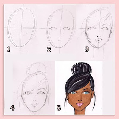
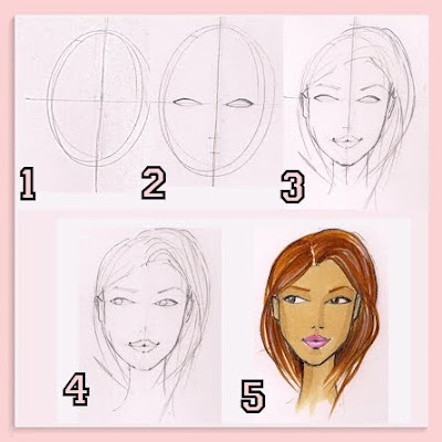
I've received lots of emails asking me to explain drawing faces. Similar to "poses" the face is easiest to tackle from the front, head on. (No pun intended!) Three quarter and profiles are a little more difficult, so I'm only going to explain the front view for you now.
  1. You start by drawing an egg shape with lines up and down and side to side, both through the center.
  2. Halfway between the bottom and the center line you mark a dash for the nose, and halfway between the nose marking and bottom you mark a dash for the mouth. The eyes are drawn right across the center line. They're almond shape, and the space between them is equal to the width of one eye.
  3. Draw the hairline, the contour of the mouth and the eyebrows. This is also the time to contour the face. You can curve in at the eye line, the cheekbones, and shape the jaw line.
  4. Add the eye iris, the colored part of the eyeball. It should be a circle that is "cut off" by the eyelid and the the bottom lash. Having the iris "cutoff" is one of those details that makes the illustration more authentic and real looking as opposed to a floating dot of color surrounded by white.
  5. Color. First lightly erase all your lines. Then start by adding one coat of the chosen skin tone, then with the same marker draw the shadows on the upper eyelids, side(s) of the nose, top of chin, cheekbones and neck. Also apply color for hair (for previous tip on hair click here), eyes, and mouth. And polish off the sketch with colored pencils.
This is a very basic face. Of corse you can create a more unique face by angling or enlarging the eyes, or narrowing the mouth, or pulling it to one side to create a smirk. You can also play with the face contour and jaw to make a long and narrow face, or very angular face. The possibilities are endless. Like I suggested with poses, it also helps to have photos to reference.
If you have any questions on faces, please ask me in the comments section so that your question, and my answer, can be shared with everyone.

Oscar’s Gifting Suite


This week I had the opportunity to participate in an Oscar’s Gifting Suite! Within just a few days I made 100+ samples to “gift”, hopped a flight from NY to LA, and shared my work at a Beverly Hill’s invite only pre-Oscar’s Gifting Suite.

There was a lot of last minute prep involved, since I was notified about this event pretty late in the game. But being that I’m no stranger to all-nighters or some hard work, and had help from good friends, everything came together without a hitch.

I met some fantastic people, including representatives from the other 15 companies participating, Oscar nominees, television and film stars, musicians, and pro athletes. Everyone seemed to really love my work. I got fantastic feedback from the guests as well as gave three filmed interviews! (I’ll see if I can find them online and share them with you here soon.)

In addition to gifting prints, posters, and bookmarks, I also gave some gift certificates for a custom illustrations which can be used towards a custom bridal illustration or to capture their favorite red carpet look.

The gift certificates are also being included in gift bags being sent to the ladies of One Tree Hill; Sophia Bush, Bethany Joy Galeotti, Jana Kramer, Lisa Goldstein, and Shantel Van Senten. As well as Maria Shriver, and Jamie Lynn Sigler. It was a great event and what is hopefully the first of many.

(If you want to see all the photo's I'm going to post them all in album on my facebook fan page, so if your not a fan already there's no time like the present!)

Red Carpet Moment: Gwyneth at the Oscars


I’ve been waiting for this post ever since photographing this sketch and swatch at the Audrey Schilt exhibit at FIT. I’ve always been a huge fan of the Oscars and this is one of my all time favorite red carpet moments from Oscars past. Every girl should have a pretty in pink moment and Gwyneth’s 1999 Ralph Lauren silk taffeta gown was nothing less then fabulous in my opinion. Not only did Gwyneth win Best Actress that year, but rocking this dress she was the best-dressed winner as well! (As you can see from the tear, Vogue agrees!)

To watch the dress, (and Gwyenth) in action click here for a video of her emotional 1999 Oscar win and click here and here for my previous posts about Illustrator Audrey Schilt. Don't forget to tune in for tonight's live Oscar show! Fingers crossed there will be some fabulous fashion.

Illustrator: Steven Broadway


Meet another one of my college professors from my FIT days, Steven Broadway. I thought it was time I shared another example of the talent I was exposed to and got to learn from. You've already "met" Renaldo Barnette (here and here), and I've recommended (here) Steven Stiplemans book to every aspiring illustrator that contacts me! This is the work of fashion illustration professor, Steven Broadway. Fabulous, right! He has not only worked as a designer and illustrator in fashion, but in costume design as well.

Back when I had him as a professor he had just completed illustrations for the movie Zoolander! You can check out his website (here) if you would like to see more of his portfolio. A sketch I did while in his model drawing class was actually up in my Etsy shop until recently. (It's now sold out, but you can see it here.)

On another note, I have to apologize to you. Something exciting came up two days ago and I've been crazy busy. I'm actually off to LA in a few hours. I know my "Tuesday Tips" have been a big hit, but I'm going to have to skip this week. Maybe next week I'll give you a double dose to make up for it!