Lovely List: Favorite Posts


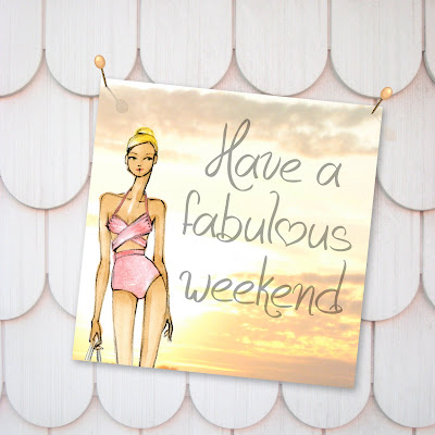
I'm off to DC soon for the long holiday weekend, but decided to first post these images as a nice visual to kick off to summer. The scalloped shingles are my friends neighbors in Brooklyn, the sunset was in the Hamptons last summer, and the girl is an older illustration I did years ago inspired by a Michael Kors runway look.
Since there's now a year of posts behind me it seems to be a good time to go back and take note of some of my favorites. Here is a list (and links through the dates) to my top posts from the first year of Fabulous Doodles.
I also have a separate list for next week of favorites featuring other illustrators! Should you feel like sharing I'd love to hear which post(s) have been your favorites and I hope everyone has a fabulous and relaxing long weekend!

Happy Birthday Fabulous Doodles


It's my first "Blog Birthday"! I can hardly believe I've been authoring a blog for a year now. I'd like to say a big thank you to you, all my wonderful readers! I'm so grateful for your support, encouragement, questions and comments.

I was extremely intimidated to start writing and putting myself out in the blogsphere for all to see, but its been such a positive experience. When I started Fabulous Doodles I thought I would simply share new products added to my Etsy shop and the occasional fashion illustration from designers. I had no idea people would contact me for advise and that my blog would turn into sharing not only my illustrations and current projects but books, tools and tips for others to use and learn from.

One year has past, 135 posts, numerous freelance projects, features, press, and Fabulous Doodles continues to grow. You can check out my first post, by clicking here, and see how I timidly started. Once again, I thank you and look forward to your comments, tweets, and facebook fan page messages in the next year.

Inside the Sketchbook: Renaldo Barnette


As promised I have more fabulous fashion illustrations to share with you from the sketchbook of my friend Renaldo Barnette. These illustrations are a small sampling of the inner (and outer, with the cover sketch pictured above) workings of his sketchbook and how he builds on ideas and develops his designs.
I love how he uses dress forms here to illustrate the back of designs. Its different and adds depth to the pages but its also such a genius time saver. I didn't actually discuss this with Ren, so I can only speak for myself here, but each illustration takes time, even if its just a back view. So to not have to illustrate another set arms, legs, head of hair, etc. helps your design rhythm to flow and stay focused on creating.
Another element in Renaldo's sketches that I admire is that he illustrates a variety of ethnicities and bodies. Many illustrators stick to one overall look but that is clearly not the case for Renaldo. You even see evidence of that in the few images in this one post.
These were just a few samples of Renaldo's work that I quickly photographed while we sat on park bench in my neighborhood with an hour to kill. Hopefully he'll let me share some more with you again soon. (And hopefully next time there won't be a sketchy homeless man serenading me!) Because I love a good Renaldo fix, as I'm sure you, my readers, do too!

My Carrie Sketch Hits Sydney


Occasionally I license out my fashion illustrations for usage by other companies. Recently Sydney's Observatory Hotel contacted me to buy the usage rights for a few invitations they were designing for upcoming events. One event is a private screening of Sex and The City 2. (I'm ridiculously excited for this movie!)
Unfortunately I won't be heading down under anytime soon so I'm just going to have to see it in a regular theater sans champagne, but I do love the final invitation and how my Carrie illustration looks against the black background.

You can check out this post (here) from when I first sketched this look and if you'd like to frame a Carrie print for yourself you can order her from my shop.

Etsy Home Finds


My old friend Camilla, blog author of High Heeled Foot in the Door, asked me to write a guest post for her today. I'm so honored, I've only been asked to be a guest blogger once before. (A wedding post for the Etsy Storque, which you can check out here.) Her blog is an interior design and home decor focused blog, so I chose to write about fabulous Etsy finds in my favorite "home" color palette; cream, white, and silver. Click here to read my guest post.

This little teaser photo is one of the items I chose to feature; a steel memo board from Ekoh Design with a silhouette print of classic furniture and home accessories on it. (Which I actually purchased just last week.) The fashion illustration magnets are the newest products added to Brooklit, my Etsy shop.

Renaldo Barnette for Maggy London


Tonight I had the pleasure of catching up with my good friend Renaldo. While chatting about life, love, our mothers and fashion, Renaldo shared the latest designs from his sketchbook with me, and let me photograph them to feature here on Fabulous Doodles.
One of Renaldo's designs for Maggy London was recently featured in a Macy's ad in the New York Times! It's so impressive to see a published design next to the illustration that created it in the middle of a sketchbook.
I just love Renaldo's sketches, and don't these newest girls seem to ooze confidence with their edgy short hair styles.

Next week I'll share some more sketches from Ren's book, but in the mean time you can check out my previous posts I wrote about him last year here and here.

Yellow Bridesmaid Dresses


Do you ever get completely consumed by searching for something that it starts to become the only thing you see? Every store I go into, every website I'm on, I'm searching for a yellow bridesmaid dress for a wedding I'm in this coming August. Its like my eyes glaze over into the green x-ray "scanner vision" that you see in thriller/spy movies zeroing in on their targets.
I've decided that maybe like in the movie Field of Dreams, "if I build it, it will come." I've drawn a few sketches of yellow dresses that I would love to find for this wedding. Something simple, loose, short, and yellow (being the brides color of choice). It's in August, so it would be great if it was strapless and a light weight material, and something that would look cute with flats or espadrilles, because its outdoors and I'll be walking in grass, so heels are out.

Clearly I have a serious case of "yellow bridesmaid dress" on the brain. But I've drawn it, and now written about it, so fingers crossed this does the trick and my dress "will come!" It's now officially out there in the universe! :)

New to my shop: Magnets


I've added three new magnets to my shop. Vogue, Carrie, and Catherine are the three illustrations I've chose to brighten up my fridge and my shop. I had them printed on smooth vinyl with a magnetic backing, so they're vibrant and super durable. Click here to see more photo's of them and purchase some for yourself.

Tuesday Tip: Denim


Back by popular demand, here is a new Tuesday Tip! A few people have asked me about how I render denim and jeans, so I've put together this little tutorial. To start you need to choose your denim color. The two colors that I use most frequently for denim are the Pantone 652-T (which I used in these examples) for lighter denim and the Copic marker in Agate B99 for dark denim.
  1. Take your chosen color and fill in the garment with a solid wash.
  2. With the same color, draw thin diagonal stripes. This can be with the fine tip end of the marker (this Pantone marker has 3 tips) or with a colored pencil in the same color.
  3. Draw diagonal lines with a white pencil. *This is the key step to rendering denim effectively!
  4. Using Cool Gray 90% pencil draw the seam lines. Then you have the option of taking a yellow/orange pencil to draw stitch lines parallel to each seam line. (This is not a must)
Something to keep in mind is that you can also add shadows and highlights within that first step. If you leave some white streaks, they will act as your highlights. And by applying a second layer of the marker to select edges and folds you can create shadows. This is exactly what I did to render the jeans shown in my "doodle" at the top of this post. For older posts with more of my illustrations of denim click here, here, or here.

I know everyone really enjoys the Tuesday Tip posts, therefore I've brought them back, however I can't promise to write one every tuesday. They are extremely time consuming so for now I'm going to shoot for one every 2 or 3 weeks. Enjoy!