Face it


Last week someone posted a question to me on my Facebook fan page asking advice on drawing faces. I've since emailed her a few tips and a book suggestion but I thought I'd share one of my tips to here with you. It's something that helped me, so I thought it was worth it to share and maybe you'd want to try it as well. What is it I'm talking about? Copying.
Let me elaborate. It started when was hired by Timex to do a bunch of illustrations. (Previous post here) They emailed me their previous style guide and I was extremely intimidated by the illustrations of the previous illustrator. I wasn't sure I was right for the job and if I could give them what they needed. Like a lot of artists and women I guess, I tend to be my biggest critique and often have a lot of self doubt. So I decided to copy, or as we used to do back in high school, do "a study" of his work to see if I could pull it off. (shown above)

It really helped me and gave me the encouragement I needed and changed the way I illustrated. I really liked how the lips came out and have since changed my technique with them. It also inspired the necklace and turtleneck I chose for this Marie Antoinette sketch for Material Girls blog.

I'm not saying to flat out copy, publish, sell, or even fully take credit for someone else's idea and creativity. It's just an exercise that I've found to be helpful, especially when it comes to things that can be difficult to figure out such as faces, hands and profiles. You just may teach yourself something new in the process!

Bride for "A Good Affair"


A Good Affair has launched their website this week and it features one of my custom bridal illustrations. I sketched this bride after collaborating with the site's founder and web designer, Natalie and Chris. They wanted a bride who was fashionable, chic, and on trend while still being timeless. She also had to coordinate with the colors of the site and be a blue eyed blond with lots of sparkle.
It was a fun project to work on and I'm really happy with the outcome. They've ordered a poster size print of the bride along with 100 custom gift tags, so I still have some work to finish up on this one. Tags are cut, now I just need to string them. All one hundred of them!

Makeover Monday


It all started with Audrey (previous post here) and now my Vogue girl has gotten a makeover. I love her, she's one my very first illustrations for Etsy, and I use her for all my promotional materials, branding and logo's but I thought she needed some work (a facelift of sorts!) So I've given her some new pretty pale green eyes and pouty pink lips.
But she's not the only one. My mom emailed me a few weeks ago suggesting I redraw Global Girl, so being the always obedient daughter (yeah right) here she is. I do admit she was getting a little tired looking, so I've spruced her up a bit and, given her some pockets because I love a dress with pockets, and a more polished overall look.
Here are links to all the new and improved ladies in my shop: Vogue II, Audrey II, Audrey II Lacey, and Global Girl. The original ladies are still up in the shop and on sale for half off. I will be retiring them in 2 weeks. Here's my shop sale section if your interested in owning the illustrations that got Brooklit started.

Project We Do IIl


With all the craziness of holiday parties, and the new year I forgot to post pictures from Project We Do, the wedding I worked on! (Previous posts here and here) Everything went smoothly and I actually had a blast dancing the night away with friends.
My little wedding illustrations ended up being used not only on the wedding website and invitations, but on the programs, table numbers and take away post cards too. I think they were a hit!
Balloons by Balloon NYC, Flowers by Poppies and Posies, Cake toppers by GooseGrease, Cake by Chantily, and illustrations, straws and table numbers by yours truly.

New to my shop: Magnets


I love trying my girls out on new products. In an effort to make my fridge a little more fashionable I've taken some of my favorite illustrations and had them printed on magnets with the same pretty pink ombre background as my shop and blog header. I added them to the shop, and you can check out the listing here. I think the ladies really compliment the photo of my grandparents vacationing in Miami back in 1946. =)

Scarves and Stripes


It think its about time for another post from the Audrey Schilt exhibition from FIT. (For previous post click here.) These wonderful fashion illustrations are from the spring 2005 Ralph Lauren Spectator collection. This collection is one of my favorites, the simplicity and elegance of black and white and her illustrative style for this collection is pure sophistication. I love that they have this loose casual gesture drawing vibe while at the same time being strong, confident, bold women.
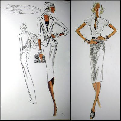
Here's what Audrey's wrote about the collection and her illustrations:
Black and white with its clean lines and sharp contrasts are among my favorite approaches to this collection. The overall look of my sketches are strong and forces me to be bold with my line and silohette. There's a mensy feeling to Spectator with lots of jackets, coats and tailoring! The prints are often used to soften the menswear edge...The stripe hates added a touch of whimsy. The shoes and accessories were very important to the look... lots of spectator heels, and oversized bags in black and white. A shot of color in the accessories resulted in even more excitement. A winning collection.
A winning collection it is! I love all the layering of accessories; scarves, bags, shoes, hats, jewelry and even cigarettes! Isn't it funny to see cigarette's in designer fashion illustrations. Its like seeing them in a tv show or movie these days, it just doesn't seem kosher! But I love the ladies anyway, it just adds to the French vibe of the collection.

Showerific


As if getting packages in the mail wasn't exciting enough, its ten times more so when it's a surprise package you weren't expecting! I came home to find a box at my door from River Cottage Farm. At first glance I thought maybe I had ordered something from etsy late night and forgotten about it (which does happen on occasion), but when I picked up the box I instantly knew some sweet handmade body products were awaiting me because the return label had my fancy farmgirl sketch on it! As do all the yummy shower scrubs, sugar cubes and lip balms that were inside. It's such a thrill to see my illustrations on actual products, and amazingly smelling ones are even better. Here's an old post about working on this project.

Carrie me Away


I stumbled upon the Sex and the City 2 trailer and now it's as though all is well in the world again (not to be dramatic or anything!) I couldn't be more excited. I miss Carrie and the girls, don't you? Inspired by the fabulous movie poster I drew my own Carrie complete with the gold aviators, c-c-curly dirty blond locks and her signature strut.
For the first movie I went to see it opening night with my girlfriends, but had serious doubts that it couldn't possibly live up to the series and I went in with very low expectations. Well was I ever wrong. I loved it! (After I drew "They're Back" showing the ladies in four of my favorite looks from the film.)

This time around consider the lesson learned, I'm getting excited starting now! How could you watch this trailer and not get excited!?!? It has NYC complete with fabulous fashions thanks of corse to the brilliant Patricia Field (whom I was lucky enough to intern for in the wardrobe department of SATC season 3 back in 2000), more international travel (my friends and I visited Egypt this past summer, I wonder if that's where they're vacationing, kind of looks like it), and I think I even spotted a wedding scene in there too!

Maybe after seeing the movie I'll illustrate the other three ladies as well. Miranda has been looking super chic these days, I bet she'll have a few fabulous fashion moments in this one. Until then, I hope you enjoy Carrie. I'll post her in the shop soon.

New & Improved Audrey


Nearly 3 years ago I opened my etsy shop with sketches including Audrey and Vogue. I have since steadily been drawing illustrations specifically to sell in my shop as art prints, cards, tags, and bookmarks. And although Audrey has been one of my top sellers I've improved my techniques since I drew her. (If I do say so myself.)
I re-drew Vogue for my twitter page and logo and now I've decided to re-draw Audrey, a new and improved Audrey if you will. I started off by simply re-drawing her, but then thought I'd add a lace applique. Once I started I couldn't stop! I first tried one band, then covered the entire skirt, then decided maybe the top could use some as well. (I scanned her after each addition in case I hated the outcome.) I'm not sure which one to choose for the shop. As you know I'm the queen of procrastination when it comes to decisions for myself!
I'm leaning towards the last one, with all the lace, maybe leave the all white dress for the original Audrey. . .But then again I like the one with the single band of lace as well. We shall see. I'll let you when I list the new Audrey and new Vogue, until then a bunch of my "oldies" are on sale, get em till they're all gone.