Showing posts with label Tips. Show all posts

My Fashion Illustration Career Journey


Eleven years ago I started this fashion illustration blog, Fabulous Doodles along with my Etsy shop Brooklit followed by Brooklit Bride. I remember being excited but nervous about putting my work out there for the world to see. I also recall thinking it would be a side job (laughable now!) that fingers crossed could possibly lead to more. Something I'd write once in a while, get commissions from here and there, because that would be nice and who knows, I'd see where it went. What did I know for sure was that fashion illustration was my passion and sitting at a desk in a corporate office from 9 to 5 as I had been was not. (Although I was a Brand Designer for Hearst Magazines, so I did style, shop and design photoshoots and get be creative. It's not like I was selling insurance in my former career.) But I digress.

The day I launched a coworker featured me and my work on her blog, which immediately lead to multiple blog features, some of which were by very big and well known names in blogsphere at the time. Not soon after came my first my first commission for a global brand and then my first feature in a magazine. Every article, job and write up was so exciting! It felt electric. I remember running to my coworkers desk to tell her anytime an email came in with a fashion illustration inquiry.  Not soon thereafter though I lost my job during the recession. I remember crying to a friend that afternoon, not knowing what I was going to do because I'd just resigned the lease on my Manhattan apartment for two more years so the option of even moving home was out...So I kept blogging and following my passion but in those first years it was tough. I collected unemployment, (which back then was a whopping $485 a week I believe) I took odd jobs and even though I was well past my teen years I was back to babysitting again because you gotta do what you gotta do to the pay the rent and bills. But through it all I kept the blog and my Etsy shop going. And I kept taking commissions and promoting my work. Because as I always tell aspiring illustrators, you need to be consistent and passionate about promoting your work because no one else is going to do it for you, especially in the beginning. 
I began to gain more name recognition, clients and my career took off once I began regularly illustrating for Vogue. Its honestly still surreal to me, being a lover of fashion my whole life that I get to type that sentence. But it is, and it was. I've told this story countless times before but being a key part of my journey I certainly can't leave out here, so here it goes. I was blogging, taking commissions and going about life when a fashion PR girl reached out to me to live sketch her midsummer night soiree for fashion bloggers. I said no. This was something I was asked to do frequently but always turned down. I hated it when people watched me sketch, I didn't draw fast and the whole thing sounded overwhelming. Well she was very persistent and kept asking and I eventually gave in and decided to just try it. To my surprise it went really well and I wrote a blog post about it. The very next day I had an email from Vogue's head of events inquiring about my event sketching services! We set up a meeting and within a few days I was sitting in the Vogue lobby with my portfolio fully about to pass out. The rest is history. She hired me for her event and it was the first of many, many events I've worked on with Vogue over the past 8 years. They've sent me to on sketching tours of the country for 3 or 4 consecutive years and have collaborated with brands such as Clinique, Dior, Gap, La Mer, and Viktor & Rolf. Having Vogue as a client opened the doors to meeting many other designers and brands as has just being a guest a Vogue events and meeting future potential clients in person, when Voguers introduce me as their illustrator! Since Vogue I now also work with Burberry, Chanel, Cartier, Salvatore Ferragamo, Harry Winston, Pierrier-Jouet and Mindy Wiess Events to name a few.

I'm sharing all this now is because its a difficult time once again with this pandemic and the economic fallout for many including me and my business which is primarily doing live events--which have obviously have all been canceled in the last 6 months and counting. I'm trying to remain positive though and taking solace in knowing I've gotten through tough times in the past and I'll get through it again. I'm also trying to focus on the areas of my business that are not event based, pivot my efforts and and work on expanding my website, rebranding, and creating a new collection of work. I hope sharing my journey was insightful and maybe even helped you in rethinking your own. You never know how saying yes to one event, writing one blog post or taking one meeting could be launching pad of your career. Do you have any questions? Let me know in the comments below! And be sure and check out my new newsletter so you don't miss any of the new things I'm working on!

Featured by Moo: Inspiring Fashion Illustrator


I'm excited to share an interview and photoshoot I did with Moo, the company I have used to print my business cards and paper products for years! Moo sent a photographer from the UK to New York to photograph and interview me in my studio for their "Moosletter" and blog a few months ago. The feature has finally come out and the feedback from readers has truly been overwhelming filling my Instagram dms and email inbox with the loveliest notes from aspiring fashion illustrators and artists who've found my story to be inspiring. I have to admit it was nerve racking having someone photograph me in my studio but the feedback had been so heart warming and I hope to start sharing more of my studio and work life with you.
Being able to print a variety of my illustrations within one order of business cards and always have a "mini portfolio" on hand has been invaluable to me as a freelance artist. If you've yet to try Moo you can receive 20% off your first order with my friend referral link. In all honestly I couldn't recommend their products more. The luxe business cards are my personal favorite but I print my illustrations on their note cards, postcards, mini cards, and stickers.
Thank you for reading and encouraging me on this journey as a freelance fashion illustrator, and thank you Moo for the fabulous feature! I'm in seventh heaven to be highlighted by a brand I truly admire and have been a client of for years.

Related posts to check out:

New Year, New Goals!


Happy [belated] New Year everyone! Last year was a rough one all around but I'm going to try and turn it around in 2017 and thought I'd share my work related goals with you, since sharing something can be motivation to stick to it, plus they may help some of you as well.

1- Blog! I've been blogging here on Fabulous Doodles nearly 8 years now! Its unbelievable how time flies. When I started it was only meant to be a marketing tool for my then "new" side business selling prints of my fashion illustrations on Etsy when not working my corporate 9-to-5 as a designer for Hearst Magazines. Well, the recession happened, one custom illustration turned to many, as did one live-illustrating gig and now I'm a full-time fashion illustrator with a blog going on 8 years. A few days ago I was looking for an old post and couldn't believe what I saw on the blog sidebar archive. All my posts are listed there by year and for 2016 I only posted 19 times compared to the early years of posting 80+! So that being said, my first goal is to blog more! Blogging is tough, and time consuming but I need to make it more of a priority. My issue has been its permanence and my perfectionist tendencies. Due to this, posts often take hours of photo editing, photoshopping the layout, and writing and rewriting. Often times I work on posts for hours only to never hit the daunting publish button! (In full disclosure here this post is one of them! I originally wrote it just after New Years and only now finishing and publishing it 2 weeks later.) I have to stop getting in my own way and just do it already! The problem is in recent years social media has become so prevalent and easy that posting to Instagram, Snapchat, Facebook and Twitter have almost replaced the blog. But I have so many client projects and events I've worked on over the past few years that I wish I shared and were here to reference. Blog posts also serve as a powerful marketing tool and expose my work to readers and potential clients who possibly wouldn't have found me otherwise. For example the last post I wrote was about live sketching a bat-mitzvah and I've had countless inquiries since posting it and even booked two new ones for coming weeks. My blogging laziness has to stop and in 2017 I'm going to turn it around and just do it!

2- Take more classes and workshops. I recently took a calligraphy workshop and it was wonderful. (Check out the fancy new calligraphy pen I learned to use above on the left!) I love learning new creative things and improving upon my skills. This year I want to delve into learning by taking workshops and classes in more areas that interest and possibly scare me. I often receive emails asking how to become a fashion illustrator or how to improve their sketches and I always tell people that taking a class, even if only related, like figure drawing or portraits, will only help you and improve your work! Speaking of, I want to take a portrait class to better my ability to capture peoples faces when I'm live-sketching parties and brand events. I also want to improve my digital drawing abilities, take a cooking class or two and maybe even a business or communication course. A few weeks ago I decorated a cookie monster themed cake for a friends 2 year old son's birthday and shared it on social media. I was reminded that back in high school my best friend and I enrolled in a series of cake decorating workshops and loved them! We used to make ourselves cakes that simply said Happy Tuesday to practice our icing techniques. I miss that. Being creative in other areas than what is now my job.

3- Hire experts to help me in areas I don't excel. Being a freelance artist is hard and building my business is challenging. As a freelancer your income is not set and you never really know what your income will be form month to month that it makes it hard to invest and spend on something that could seem like a luxury. There are so many areas I've wanted to improve upon though, and I although I try and figure things out on my own and try to do everything myself its time I took steps and hired people who actually do these things for a living. It's an investment in my business and well worth the cost. Its time! A few examples I've been considering and need to hop on in 2017: hiring a graphic designer and web developer to build a website because although the blog has been wonderful I need to expand and have needed to for some time now. Also a financial manager to help me organize my finances, and possibly a public relations person to try and get me onto some of those "best illustrator" lists I see often but sadly have yet to appear on even though I continually work with top publications.

4- Go after the gigs! Thus far in my freelance fashion illustration career nearly all the work I've had found me, not visa versa. Clients, collaborations, licensing deals, etc, almost all have come about because they approached me. I need to focus on where I want to be and who I want to work with more moving forward. I know many other bloggers who pitch potential clients and press and I need to not be afraid and start doing the same. I need to compile a client list and start reaching out to previous clients to check in, see if they have any potential collaboration opportunities on the horizon and even pitch concepts on how we can work together. I also want to start a newsletter with monthly, or at least seasonal updates to all my clients and customers.
5- Grow my social following. This is an eye roller, I know. Everyone who blogs and uses Instagram for business purposes wants to grow their numbers. I'm currently at 21k Instagram followers which may seem huge, but when compared to fellow fashion illustrators, some of whom started blogging the same time as I, it's seriously small potatoes. I haven't been "featured" by Instagram which is the main problem and since they changed their algorithm and everyones views and engagement has dropped I fear its too late now. That being said I look at my Instagram feed and my top posts of last year (shown above) and I'm proud of my work and photos. I'm also proud that I have never bought followers, sold out, or gained likes because of nearly naked photos of myself. All 21k+ followers are real people who follow me for my talent and not a paid for illusion, as I've learned over and over again many others have done. All I can do here is continue to try my best and post what I'm proud of. Last year one of my posts went semi-viral (image on top left) with over 142k views, so maybe this year instead of one post, my whole following will blow up! (Fingers crossed;)

These are just a few of my goals and of couse if I were to get personal the list would be at least double in size, but it's a start and I'm proud of myself for not only writing it down but posting it! (Check mark next to number 1!) The world seems to be going a little nuts these days and who knows whats ahead in the coming year but at least I have control over where I want to focus my attention and business. How about you, what are you business goals? And anyone in the NY area have any amazing classes or workshops to recommend because I would love to hear about them!

Teaching Fashion Illustration at Stitched Fashion Camp


A few weeks ago I spent a day out in East Hampton teaching fashion illustration to the adorable campers of Stitched Fashion Camp. Stitched is the brainchild of Elle's creative director Joe Zee and Parsons adjunct professor Rob Yonkers. Its a week long summer fashion day camp that encompasses all the elements of the fashion industry and I had the honor of being asked to join as the industry expert on fashion illustration!
I prepared a handful of lessons including croquis (aka. fashion figures, its taken from French, the literal translation is "sketch." Its pronounced crow-key) development and various fabric and pattern rendering techniques, many of which were taken directly from archived Fabulous Doodles posts. I gave the fashion campers a lesson in fashion figures and poses and demonstrated rendering fabrics including sequins and beading, leopard, zebra, and denim. We also worked together one-on-one and I gave mini tutorials on drawing elements like faces, hair, hands and feet, just about anything the kids said they were struggling with drawing.
Throughout the day the kids tried the fabric rendering techniques I taught them and worked on illustrations of looks from their own mini collections. Many used the ditto's I handed out as a guideline, one of which is the photo-to-croquis example shown above (for more fashion figure info you can click over to my pose tutorial post.) And others created original fashion figures of their own from photo inspiration. Below is a picture of some their fabulous illustrations fresh from their sketchbooks.
Spending a day out in Hamptons and getting to work with these 12 kids ranging in age from about 10 to 15 was truly fantastic. The kids were so adorable, and so eager to learn and improve their illustrations. I have to admit I was a little nervous going in, as I had only ever tutored before one-on-one and this was my first real classroom setting but I have a feeling it won't be my last! It was such a wonderful and fulfilling experience, especially seeing the excitement in the kids eyes and the pride they exuded when they saw what they could achieve.

Click here for more about Joe Zee and Rob Yonkers Stitched Fashion Camp and if you're interested in my private tutoring and located in NYC you can email me at FabulousDoodles@gmail.com for rates.

Giveaway! {Fashion Illustration Books}


I have two exciting Fabulous Doodles giveaways! Enter to win one of the fashion illustration books I recently worked on: Girly Girl Style and Harajuku Style, both illustrated by moi, Brooke Hagel. I posted about both books a few weeks ago when they were first released, sharing peeks inside as well as little descriptions and insights, which you can check out here.
Two winners will be chosen, one for each book. To enter simply click on the link below and follow the instructions. Easy peasy! You can enter multiple ways to earn more entries, so make sure to enter your email, tweet and give a Facebook like. The winners will be chosen randomly by Rafflecopter. Good luck!

a Rafflecopter giveaway

Fashion Illustration Books {Brooke Hagel}


I'd like to share the first two fashion illustration books I've illustrated! They are part of a new instructional series by Capstone Publishing called "Fun Fashions You Can Sketch" and as of February 1st they're out and available on Amazon for purchase.
Harajuku Style: Fun Fashions You Can Sketch, showcases Tokyo's Harajuku culture and style. Sketching and learning about Harajuku girls and their style was something completely new for me. Harajuku girls are all about themeing out an outfit and piling on layers and accessories to complete a look from head to toe. They made for some really fun illustrations including Mixed Traditions (shown above) my favorite illustration of them all, Take it to the Street, and Tokyo Punk, amoung others.
The second book, Girly Girl Style: Fun Fashions You Can Sketch, showcases ultra girly and feminine designs. Similar to the Harajuku book, I was given precise outfit design direction for each look, such as On the Runway, Crocheted Cutie, Style at Sea and Radiant Romper (all shown above) and drew detailed illustrations building a sketch from a loose gesture drawing to polished final illustration.

As I was only hired to illustrate these books and not write or consult as to how to actually build a illustration, I do have a difference of opinion regarding how to render some fabrics and build an illustration. In actuality I don't really draw this way, with this many steps and layers, however these books are for beginners, focused primarily towards tweens, so the illustrations are broken down and made clear. They are fun little books and would make a great gift for any fashion loving tween. The books are being marketed to school libraries, however they're also available on Amazon.

It has been a interesting experience illustrating my first two books. Like many projects it was really a learning process, with ups and downs along the way. Deciding how I wanted my name to appear in the Library of Congress was pretty cool and debating some of the design direction was a challenge, but I'm excited they're out there now. I hope kids enjoy them and hopefully they're the first of many more books throughout my career. Check back next week for a giveaway and your chance to win one!

Tuesday Tip: Illustrating Zebra


This week I have another animal print illustration tutorial, zebra print. Similar to leopard print, which I wrote about here last tuesday, its organic, fluid and always different, therefore pretty difficult to mess up. 
The key to a successful zebra print rendering is having a brush tip marker for the stripes. A brush tip is essential because you have to really "work" the marker tip. By pressing down hard for the thick areas then releasing up to the thin tip, you can achieve sharp points that create those fluid zebra stripes. Something else to keep in mind is the zebra stripe needs to be darker that the base color you choose. Here I chose black and white, but even in the examples below, with the more contrasting combinations, I rendered the stripes always darker than the background. It is possible to reverse them and render the stripes light with a charcoal pencil or gauche, but its not something I practice or recommend.
1- Color the base coat color and fabric shadows. For my example here since I went with a classic black and white print, I skipped putting in a base coat and only drew in shadows, which you can see in faint gray on the left side of the bathing suit, beneath the bust, and into the shoulder gathers. 

2- The zebra stripes are next. As I said, a brush tip marker is vital for these to be really successful. You can start your stripes from the top of the garment in simple horizontal stripes then alternate from side to side. (See example below.) First a thick stripe coming out from the left side of the garment into a thin center line. Then from the right, pressing my marker down on the right side and releasing the marker tip up into the center just below the previous stripe from the left. And so on, covering the whole garment. 
 You can also start with or put somewhere in your print a "V" formation. This will mimic the center of a real zebra hide. (As I did towards the lower half on my bathing suit illustration.) If you'd like to opt for something more stylized or just do not want that center V shape, then you can stick to stripes, as I did with some of the illustrations below. 

3- Highlights. With a white pencil or white charcoal add highlights. This will give the print depth and dimension. I added highlights along both front sides (or princess panel area's for those of you design students) as well as into the gathers at the shoulder. 
Similar again to leopard, zebra can be rendered in any combination of colors to achieve different looks. Shown here (above) are two illustrations I drew with browns and natural tones for a more natural/safari look. While below are two where I went a little nuts with color. The first one on the left is a very 80's vibe with the saturated fuchsia and black combo and the one on the right is something a little sweeter, a pale pink background with coral stripes. 

Zebra is truly one of my favorite prints to illustrate, paint, and have in little bursts around me, like on my umbrella, a clutch or scarf. In college I even had an entire accent wall of my bedroom that I painted in black and white floor-to-ceiling zebra stripes! Its classic and chic and in my book a fashion staple. 

Let me know in the comments section how your zebra stripes turn out and what Tuesday Tip tutorials you'd like to see in the future.

(For this post I used pencil, white charcoal and Copic Sketch double-ended markers, offering both medium broad and super brush tips.) 

Tuesday Tip: Illustrating Leopard


Have you always wanted to learn how to accurately illustrate leopard print? Well its your lucky day, and you may be surprised to learn that leopard just so happens to be one of the easiest and most foolproof prints to draw and draw well. Being an animal skin, leopard print is organic, some parts are clustered and messy and some are open and spacey. You really can't make a mistake with this one I promise.
1. The first step is to choose your color way, and the three markers you'd like to use for the print. With the lightest one you lay the ground color for the print. I chose a dark tan color, in order to render a more realistic leopard print.

2. Let your base color dry then add a second "coat" in streaky and somewhat rough stripes, one being down the center and then as few or as many as you'd like to each side. This will add depth to the print.

3. Choose a marker that is darker than your ground color and randomly draw comma or kidney shaped "spots" with it, as I've illustrated for you in step three with brown.

4. With your darkest marker (I used black) draw three dashes or kidney shapes of varying lengths surrounding each of the kidney shapes you drew in the step three. Its as though you're messily outlining each spot with three dashes.

5. Add highlights, shadows and any garment design details with your black and white (or white charcoal) pencils. And ta-da! There you will have a classic leopard print.
Its been quite a while since my last Tuesday Tip post, but I figured what better way to get back into the tutorial mode than by showing you how to render this fun and classic print. Since I drew the tutorial in standard leopard colors I thought I should also show how easy it is to use the same steps but with colors that are a little more on-trend. Gray, black and white shown above, is a little more pop and edgy and the purples below are a colorful alternative.
If you're hungry for more you can check out my previous Tuesday Tip here, and come back next week because I'm working on another one for you. (I promise not to wait almost 2 years for another one this time!)

***I'm also taking suggestions so let me know in the comments section if there's a tip you'd like to see to help improve your fashion illustration skills.

Related posts you may like:

Armani Costume Designs for Lady Gaga


Georgio Armani recently released the latest costume design sketches for Lady Gaga's next world tour, and I couldn't wait to share the avant garde illustrations with you here on Fabulous Doodles! In Gaga's first tour, The Monsters Ball (perviously featured here) the wardrobe, which I actually had the thrill of seeing in person when I attended the HBO taped concert at Madison Square Garden, was simply spectacular and this next round of costumes looks like it will not disappoint.
I don't know about you but the sketches really remind me of the work of Bob Mackie. Aside from the obvious reasons that they're whimsical and sparkly costume sketches that are full of personality and attitude, the figure proportions, rendering techniques, and overall look of the artwork is just so similar to the work of Mackie. It really adds to the shock factor for me that they're by Armani, whom I completely have pigeon holed in my brain as being the go-to tailored suit design master.
One idea to take note of, for you aspiring designers, is that the illustrator has used the same figure to build upon for the more than one look. You can clearly see that these sketches, although drastically different from one another in the costume design, are the same exact pose and most likely drawn over the same figure. This is a sketching shortcut when your working to focus yourself on the designs and not get overly involved in sketching new poses and figures for each look.

Thank you to Armani for releasing the sketches and fingers crossed in a few months I'll be thanking Gaga for putting on another incredible show! Anyone have tickets, feel free to send them my way. ;)

Secret Weapons {Part 3}


I am continually asked what tools I use most in my fashion illustrations so I thought it was time for another installment of Secret Weapons. First up, is my sketchbook and paper of choice. This may come as a surprise, being that I make a living as an artist you may think I'd use something fancy and expensive from an art supply store, but I do not. For years I've been using these Barnes & Noble exclusive sketchbooks. The reason I like them so much is that the paper is thick, almost a card stock, and super bright white. The whiteness is important to me because I scan most of my work. They have a spiral binding, which I prefer so the book can lay flat, thick hardcovers that protect the pages well, should I decide to throw in my bag, and the piece de resistance is they have perforated pages for easy tearing out. They also come in different sizes, so I have small ones (above) for quick thumbnail sketches and traveling, and larger ones for my more polished sketches. (Keep in mind however that these are not the best choice for a beginners because, as I mentioned, the paper is thick, and not conducive to tracing. It also soaks up the marker, which means you have to move fast. When I was in college, and learning, my paper of choice was Bienfang marker paper.)
Next I'd like to share the white charcoal pencil. These are fantastic for creating highlights over marker, even better than white pencils because of how dense and opaque they are. If you take a look at my last post about my new print Miriam, you can see that I used a log of the white charcoal pencil to render the large brimmed hat and create texture and highlights within it. I also use it to add shine and highlights to hair in almost all my illustrations.

Lastly is something I absolutely cannot live without when sketching, the amazing kneaded eraser. It picks up everything from the faintest smudge to heavy thick lines. Its pliable and can be molded to easily into a sharp point or stretched out for easily self cleaning and it doesn't leave marks. The kneaded eraser is a must have. (I realize I sound like a infomercial here, but its true!)

For more of my secret weapons you can check out part 1 and part 2 here.

Illustrating Fashion: Concept to Creation


Steven Stipelman has done it again with the latest edition of his book Illustrating Fashion: Concept to Creation (3rd Edition). Stipelman's book is an excellent resource for anyone, from the aspiring student to the experienced and working fashion illustrator. The book includes step-by-step tutorials on how to draw everything from the basic fashion figure, hands, feet, and faces to clothing details like fur cuffs, tweed, lace and tulle.
In one of my very first posts on Fabulous Doodles I shared the first edition (here), as its been a staple on my bookshelves since college. In this latest edition Stipelman has updated it by redrawing more than 1,000 full color illustrations and referencing designer garments and time periods for accurate historical references.
Illustrating Fashion Concept to Creation (3rd Edition) is very easy to navigate through and use as a reference. Its divided into five main sections:
  • Getting Started: Supplies, lines, etc.
  • The Fashion Figure: Hands, feet, shaping the body, gesture and balance line.
  • The Fashion Details: Silhouettes, necklines, drapery and bias, tailored clothing and accessories.
  • Rendering: Stripes, plaids, knits and other intricate rendering techniques.
  • Extras: Walking figures, menswear, children, flats.
Stipelman is an incredible teacher and seasoned fashion illustrator, so to sit in a classroom and watch him sketch was a privelage. (I was lucky enough to have Stipleman as my professor for four consecutive semesters!) Now you can observe and learn form him as well, because with this book comes a dvd of demonstrations by Stipelman! Watching my professor and friend drawing made me feel like I was 19 again, gathered around his desk with other FIT students mezmorized by his illustrating.
This book is used as a textbook for all of FIT's fashion design students and is a splurge worthy necessity for any fashion illustrator. You can check it out, along with a few of my other book recommendations here, in my Amazon shop.

Fashion Illustration Exposed


A little while ago, I was contacted by the lovely Julia Stanescu of Fashionarium. She asked me if I would be willing to write two tutorials as a contributing fashion illustrator. Well I jumped at the opportunity and now I'm excited to tell you about the fabulous new book Fashion Illustration Exposed.
This book empowers readers to easily explore practical techniques of fashion illustration while learning about the tools and steps that ten fashion illustrators (including yours truly) employ. Mediums such as watercolor paint, pen, collage, and photoshop are all touched upon. (It has even inspired me to dig out my old watercolors and guaches that I haven't touched since college!)
It's such a thrill for me to be included in this book. I hope you all like it and like myself, learn something new. Fashion Illustration Exposed is available as a printed paperback as well as a downloadable ebook, which ten of my readers can purchase with a discount of 20% off. Its available by clicking here, and the discount code is brooklit. (The discount is only available to the first 10 Fabulous Doodles readers to purchase.)

Tuesday Tip: Sequins


A while back you may remember I wrote about my favorite tools for fashion illustration and I mentioned the whiteout pen. Well to successfully render sequins a whiteout pen is vital. (At least for this fashion illustrator!) It's also best when choosing your marker to pick a very wet and saturated marker, like a Chartpak and a classic black Sharpie marker.
I happen to really enjoy rendering sequins, especially all-over sequins (a-la Diana Ross or Cher.) There are a few specific steps to it, but don't stress, its pretty hard to mess up. And once you complete them the results are stunning.
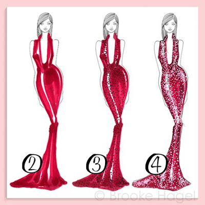
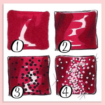
  1. You begin by coloring the base of your design. Its important to leave white streaks where you want your highlights. Let it dry a little then add a second coat of your color to areas in shadow (see example #1.)
  2. Outline the design, draw any seams, and add any extra shadowing with a dark pencil. I use the Prismacolor cool gray 90% pencil. (#2)
  3. With your black Sharpie stipple dots all over the garment (#3). Load up on dots in areas that are white and are going to be a highlight.
  4. With your whiteout pen place a dot on top of each black one. Get a rhythm going and it will be over before you know it. (#4)
  5. This is not a necessary step, but I like to add a few faint "X's" with my finest tip black pen to create subtle streaks of light. (I use a Micron pen, tip size 005)
The white dots will absorb the color you put down first, especially if you used a very wet marker. The dots will turn into a lighter shade of your color. This is why if you look at my examples, they don't look like white sequins on colored fabrics. It looks as though I've actually painted all these little colored sequins! And the tip of the Sharpie, being almost the same width as the whiteout pen, creates the perfect shadow to make each sequin pop.

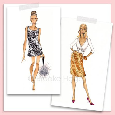
Above are illustrations from my Etsy shop of Carrie and Samantha (from the first SATC movie), both sporting fabulous sequin pieces. Carrie is available in a print, magnet or bookmark, and Samantha is on a bookmark.

Tuesday Tip: Denim


Back by popular demand, here is a new Tuesday Tip! A few people have asked me about how I render denim and jeans, so I've put together this little tutorial. To start you need to choose your denim color. The two colors that I use most frequently for denim are the Pantone 652-T (which I used in these examples) for lighter denim and the Copic marker in Agate B99 for dark denim.
  1. Take your chosen color and fill in the garment with a solid wash.
  2. With the same color, draw thin diagonal stripes. This can be with the fine tip end of the marker (this Pantone marker has 3 tips) or with a colored pencil in the same color.
  3. Draw diagonal lines with a white pencil. *This is the key step to rendering denim effectively!
  4. Using Cool Gray 90% pencil draw the seam lines. Then you have the option of taking a yellow/orange pencil to draw stitch lines parallel to each seam line. (This is not a must)
Something to keep in mind is that you can also add shadows and highlights within that first step. If you leave some white streaks, they will act as your highlights. And by applying a second layer of the marker to select edges and folds you can create shadows. This is exactly what I did to render the jeans shown in my "doodle" at the top of this post. For older posts with more of my illustrations of denim click here, here, or here.

I know everyone really enjoys the Tuesday Tip posts, therefore I've brought them back, however I can't promise to write one every tuesday. They are extremely time consuming so for now I'm going to shoot for one every 2 or 3 weeks. Enjoy!

Tuesday Tip: Lips


This week I want to get specific with you and focus on one feature, the mouth. There are many different ways to draw a mouth; smiling, smirking or even frowning. I'm going to show you my standard go-to perfect pout. Once you master this it's easy to play around and try variations.

1-Start by drawing a circle. Then draw one line through then center horizontally and another vertically.
2-Mark the sides and center with slightly darker "dashes" and begin drawing the contour of the mouth.
3-Lightly erase all the lines. (Once you add marker you cannot erase, the marker sets it into the paper.) Just leave the faint pencil lines so you can still see where to apply color.
4-Add a second coat of marker to the entire top lip and very bottom edge of the bottom lip. Then with your dark pencil lightly outline and add shadows in the center middle, center bottom, and sides.
Something important to keep in mind when drawing the mouth is the top lip is ALWAYS darker because its in shadow. Look in the mirror or some photos and blur your eyes and you'll instantly see it. Above is an example of the "perfect pout" on Audrey from my etsy shop. (Dylan, Vogue and Mystie all sport a variation of this mouth as well.)

For now this is the last tuesday tip. It was only set up as a four week series, but I do promise to resume it again sometime in the future. Thank you though for all the positive feedback! Happy sketching!

Tuesday Tip: Faces


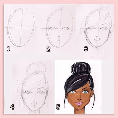
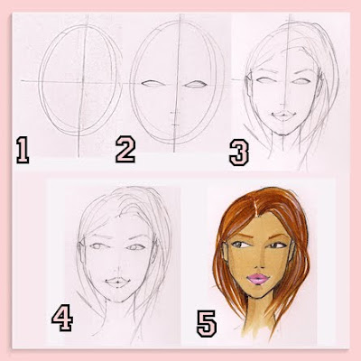
I've received lots of emails asking me to explain drawing faces. Similar to "poses" the face is easiest to tackle from the front, head on. (No pun intended!) Three quarter and profiles are a little more difficult, so I'm only going to explain the front view for you now.
  1. You start by drawing an egg shape with lines up and down and side to side, both through the center.
  2. Halfway between the bottom and the center line you mark a dash for the nose, and halfway between the nose marking and bottom you mark a dash for the mouth. The eyes are drawn right across the center line. They're almond shape, and the space between them is equal to the width of one eye.
  3. Draw the hairline, the contour of the mouth and the eyebrows. This is also the time to contour the face. You can curve in at the eye line, the cheekbones, and shape the jaw line.
  4. Add the eye iris, the colored part of the eyeball. It should be a circle that is "cut off" by the eyelid and the the bottom lash. Having the iris "cutoff" is one of those details that makes the illustration more authentic and real looking as opposed to a floating dot of color surrounded by white.
  5. Color. First lightly erase all your lines. Then start by adding one coat of the chosen skin tone, then with the same marker draw the shadows on the upper eyelids, side(s) of the nose, top of chin, cheekbones and neck. Also apply color for hair (for previous tip on hair click here), eyes, and mouth. And polish off the sketch with colored pencils.
This is a very basic face. Of corse you can create a more unique face by angling or enlarging the eyes, or narrowing the mouth, or pulling it to one side to create a smirk. You can also play with the face contour and jaw to make a long and narrow face, or very angular face. The possibilities are endless. Like I suggested with poses, it also helps to have photos to reference.
If you have any questions on faces, please ask me in the comments section so that your question, and my answer, can be shared with everyone.